

On this page · 4 min read
Most “email benchmark” reports are built from surveys. Someone emails a few hundred marketers, asks what they do, and averages the answers. The catch is that people describe what they think they do, not what they actually sent.
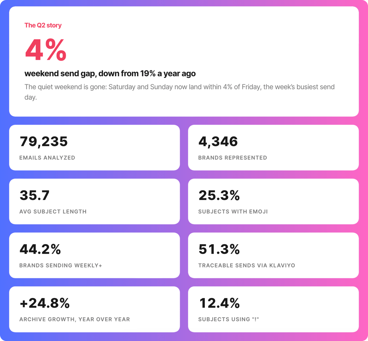
Email Love works differently. We subscribe to thousands of real brand mailing lists and archive what lands. So instead of asking, we counted: every subject line, every send day, every design choice across 79,235 emails from 4,346 brands in Q2 2026, benchmarked against the four quarters before it.
That’s the new Email Love Benchmarks report, and it refreshes every quarter. Here’s what the data said, and what to do about it.
The quiet weekend is over
For years the playbook was simple: send Tuesday through Thursday, rest the list on the weekend. A year ago that still held — Saturday ran about 19% below the Friday peak.
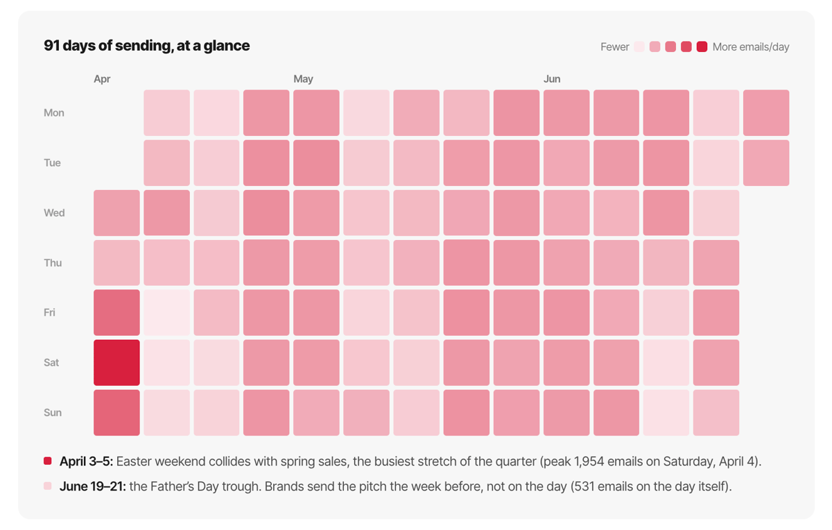
This quarter the week went nearly flat. Friday still led at 11,826 emails, but Saturday (11,643) and Sunday (11,432) were right behind it. The weekend-to-Friday gap is now about 4%.
Read that as a warning, not a green light. If everyone piles into the weekend, the weekend stops being the contrarian slot. The quietest inbox of the week is now Monday, at 10,577 emails — roughly 11% below Friday. If you have a send that genuinely needs to be seen, Monday is the least contested real estate on the calendar right now.
Subject lines are getting shorter and calmer
Two clear moves this quarter, both pointing the same way.
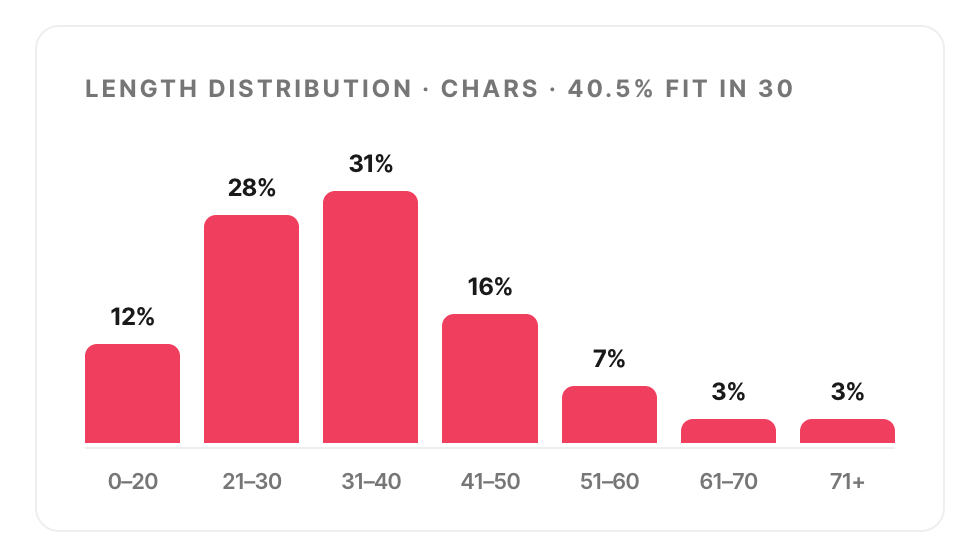
Subject lines keep tightening. The average ran 35.7 characters, down from 37.2 a year ago, and 40.5% now fit inside 30 characters. That’s brands writing for a phone preview pane and a distracted thumb.
And the shouting is being dialed back. Exclamation points showed up in 12.4% of subject lines, down from 17.4% a year ago. Emoji held steady at 25.3%, so this isn’t brands going quiet — it’s brands trading manufactured urgency for specifics.
The takeaway for your next test is small and concrete: write a variant under 30 characters, and swap the exclamation point for the actual number. “20% off ends tonight” does the same job as “Sale!!!” without begging.
Volume is up, but not the way it looks
The archive grew 24.8% year over year, which would make an easy headline. It’d also be misleading.
When we isolated the brands present in both quarters, their sending was essentially flat. The growth came from new brands entering the archive, not from existing brands sending more. The real story is cadence: 44.2% of brands now send weekly or more often, up from a year ago, while per-brand volume held steady at about 18 emails a quarter.
The market isn’t mailing harder. It’s mailing more consistently. Chasing raw volume is chasing the wrong number — a reliable rhythm is the move.
The design and platform picture
A few numbers worth keeping in your back pocket. The average marketing email ran 290 words, 20.5 images, and 28.5 links, and 25.3% carried an animated GIF. Image-heavy, link-dense layouts are still the norm.
On infrastructure, Klaviyo now powers 51.3% of the sends we can trace — a clear majority, with Salesforce Marketing Cloud a distant second. Whatever the rest of the stack looks like, the DTC inbox increasingly runs through one platform.
The global average is lying to you
Here’s the part that actually changes what you do. We broke every stat down by industry, and the ranges are enormous. Emoji use in subject lines runs from 5.8% in Higher Education to 44.8% in Cannabis. Discount mentions span from under 3% to nearly 35% depending on the category. A single “industry average” blends a university newsletter and a flash-sale streetwear drop into one meaningless number.
So stop benchmarking against the whole market. Find your category’s row in the report and set your emoji and discount policy from that, not the sitewide figure. In a low-emoji category, one emoji is a pattern break. In a high-emoji category, a plain-text subject line is the pattern break. Same tactic, opposite meaning — and only your row tells you which.
What marketers actually studied
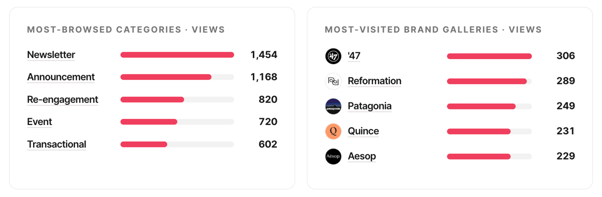
Every stat above is supply-side: what brands sent. But we also know what the 65,325 marketers who browsed our archive this quarter chose to study — and that’s a signal you won’t find anywhere else.
Newsletter design was the runaway favorite, with more views than any other category. Re-engagement emails pulled harder than several much larger categories, which tells you where the collective anxiety is right now. On the brand side, the most-visited galleries were Reformation, Patagonia, Quince, and Aesop. The single most-studied email of the quarter didn’t come from a household name at all.
The signal: attention is clustering on newsletters and win-back, not the promo blast. If you’re deciding where to invest design effort next quarter, that’s a useful tell.
Use the data, then go build
The full Q2 2026 Benchmarks report has all of this broken out by industry, a 91-day send-timing heatmap, the curated subject lines worth stealing, and a copy-ready citation line. It’s free, it updates every quarter, and every number comes from a real email a real brand actually sent.
Benchmarks are only useful if they change what you ship next. When you’re ready to build that better email, design it in Figma and export production-ready HTML straight to your ESP with the Email Love plugin. The best inbox in your category is one campaign away.
Much love,
Andy

Andy has spent two decades building email programs for brands and agencies, and now co-runs Email Love: the inspiration gallery of 591,000+ emails and the Figma plugin that lets teams design, build, and export production-ready email without leaving their design file. He writes about email design systems, production workflow, and where the industry is heading.

Customer.io delivers more impact from every message–unifying data, messaging, and AI into one platform so every customer interaction gets smarter over time. We help teams build personalized campaigns across email, SMS, push, in-app, and webhooks, using their own first-party data to reach the right people with the right message at the right moment. AI is built into the platform to remove the grunt work, letting marketers focus on strategy, not setup. Over 9,000 brands trust us to power their messaging.
 Oct 20, 2026 · 9 min read
Salesforce Is Buying Braze. It Got Me Thinking About ESP Migrations.
Read article →
Oct 20, 2026 · 9 min read
Salesforce Is Buying Braze. It Got Me Thinking About ESP Migrations.
Read article →
 Oct 14, 2026 · 11 min read
10 MCP servers for marketers, and how I use them
Read article →
Oct 14, 2026 · 11 min read
10 MCP servers for marketers, and how I use them
Read article →
 Oct 1, 2026 · 9 min read
10 Halloween emails from last year to inspire your campaigns
Read article →
Oct 1, 2026 · 9 min read
10 Halloween emails from last year to inspire your campaigns
Read article →

