On this page · 9 min read
Let me guess: your team is recreating the same email components from scratch every single campaign. Your designer spends hours rebuilding buttons that already exist somewhere in a forgotten Figma file. Your new contractor just sent out a promotional email using the wrong shade of blue and a font that hasn’t been part of your brand since 2019.
I’ve been there. Hell, I’ve caused that chaos.
After 20+ years in email marketing, I’ve seen teams waste countless hours on preventable problems. The solution? An Email Design System (EDS). And no, this isn’t some corporate buzzword that only enterprise teams with unlimited budgets can implement.
Think of an EDS like a well-organized kitchen. Instead of searching through cluttered drawers every time you need a spatula, everything has a place. You know exactly where to find what you need, and anyone who steps into that kitchen can cook a great meal without calling you for help.
In this guide, I’m breaking down everything you need to know about Email Design Systems—what they are, why they matter, and how to build one that actually works for your team.
What Is an Email Design System?
An Email Design System is a collection of reusable components, design standards, and guidelines that help you create on-brand emails faster and more consistently.
Instead of designing every email from scratch, you’re working with pre-built, tested building blocks. Think Lego, but for email marketing.
The magic is in the modularity. You break down your email designs into repeatable pieces: headers, footers, CTA buttons, hero sections, product grids, and then mix and match them to create different campaigns while maintaining brand consistency.
Here’s the typical hierarchy:
Content: Your text areas and images
Components: Standalone elements like buttons or logos that work anywhere
Regions: Grouped content and components, usually organized into columns
Sections: Full-width horizontal containers that stack between your header and footer
The beauty of this approach? You design once, use everywhere. Your promotional email, your newsletter, and your abandoned cart reminder all share the same DNA.
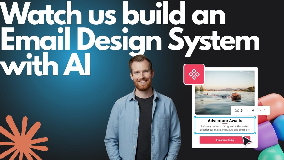
Want a good example? Check out our Free Design System on Figma:
Why You Actually Need One (Beyond “Efficiency”)
Yeah, everyone talks about efficiency. But let me get specific about the problems an EDS solves:
The “Where’s That File?” Problem
Without a system, your email assets live everywhere. Sally has buttons in her Figma file. Tom coded a header that’s saved… somewhere. Your contractor from three months ago designed a footer that nobody can find.
An EDS gives you a single source of truth. Everything lives in one place, properly documented and accessible to your entire team.
Brand Consistency
You know what kills trust faster than anything? Inconsistent branding. When customers receive emails that don’t look or feel like they’re from the same company, they hesitate. Some even mark them as spam because they assume it’s phishing.
An EDS ensures every email, whether it’s sent by your head of marketing or a new intern, looks unmistakably like your brand.
Everything in one place
Remember that campaign that crushed it last quarter? Which CTA button did you use? What was the layout? How did you structure the hero section?
Without documentation, you’re constantly reinventing the wheel, hoping to recreate past success. An EDS captures what works and makes it repeatable.
Scaling as you grow
As your email program grows, the chaos compounds. More campaigns. More team members. More requests. Eventually, your designer becomes a bottleneck, and your manager starts asking why “simple” emails take three days to produce.
An EDS removes you (or your designer) as the single point of failure. It empowers marketers to build quality emails without constant designer involvement.
Here’s a stat that got my attention: Sparkbox ran a controlled study where developers built the same form twice, once from scratch and once using a design system. The design system version was 47% faster Sparkbox. That’s not marginal improvement, that’s getting back nearly half your time on every project.
The Two Parts of Every Email Design System
Every effective EDS has two core components working together: your Style Guide and your Component Library.
Part 1: The Style Guide (Your Foundation)
This is where you define the rules. Think of it as your email brand bible.
Your style guide covers the visual elements everyone needs to follow:
- Typography (which fonts, what sizes, where they’re used)
- Color palette (primary, secondary, accent colors with exact hex codes)
- Logo specifications (size, placement, spacing requirements)
- Layout rules (column widths, margins, mobile breakpoints)
- Spacing standards (how much breathing room between elements)
But it’s not just visual stuff. Your style guide could also include:
- Brand voice and tone guidelines
- Words to use (and words to avoid)
- Technical specifications for developers
Part 2: The Component Library (Your Building Blocks)
This is your actual toolkit—the predesigned, pre-coded elements you’ll use to build campaigns.
Common components include:
- Headers (with and without navigation)
- Footers (legal text, social links, unsubscribe)
- Hero sections (full-width banners with headlines)
- CTA buttons (primary, secondary, tertiary styles)
- Product cards (single column, two-column, three-column layouts)
- Text blocks (body copy, quotes, testimonials)
- Spacers (vertical space between sections)
- Dividers (horizontal rules to break up content)
The key is building flexibility into your components. Instead of creating 15 different button variations, create one smart button component with variables for color, size, and style. In Figma, you can use Boolean properties (on/off toggles) to show or hide elements like icons or subheadings.
This keeps your library manageable instead of becoming a cluttered mess of slightly different variations.
How to Build Your Email Design System
Alright, let’s get practical. Here’s the step-by-step process I recommend (and yes, I’ve done this multiple times, made mistakes, and learned some lessons the hard way).
Step 1: Take Inventory
Go through your existing emails—all of them. Broadcasts, automations, transactional messages, everything.
Categorize them: newsletters, promotions, welcome series, cart abandonment, order confirmations, etc.
This audit reveals patterns. You’ll notice you’re using the same hero layout in 80% of promotional emails. You’ll see that three different people are using three different button styles. You’ll discover abandoned templates that should probably be retired.
Take screenshots. Make notes. This becomes your baseline.
Step 2: Break Everything Down
Now analyze what you found. Look at the components level:
- What fonts are being used? (Hopefully it’s consistent, but probably not)
- What colors appear repeatedly?
- What button styles exist?
- What layout patterns show up most?
- Which elements perform well? (Check your analytics)
Decide what to keep, what to standardize, and what to eliminate. If you have five different CTA button styles but one consistently outperforms, make that your standard.
List out every repeatable element you’ll need, including variants. For example:
- Two-column product layout (desktop)
- One-column product layout (mobile)
- CTA button (primary action)
- CTA button (secondary action)
- CTA button (text link only)
Step 3: Find Inspiration and Create Mockups
This is where I’m obviously biased, but browse Email Love for fresh ideas. Look at what brands in your industry are doing. Save examples that resonate.
Create design mockups for your components. Most designers start with a grid system to establish structure and spacing rules.
Get stakeholder approval before moving to development. Trust me, changing a fully coded template because someone decides they hate the button shape is painful.
Step 4: Establish Your Rules
Document everything explicitly. This seems tedious, but future-you will thank current-you.
Define:
- Exact spacing values (margins, padding between elements)
- Column widths for different layouts
- Mobile and desktop breakpoints
- Font fallbacks for email clients that don’t support web fonts
- Color usage rules (when to use primary vs. accent colors)
Include technical requirements for developers. For instance, specify your font stack (your preferred font plus fallbacks that have similar character width and height to prevent layout breaks).
Step 5: Design and Code Your Components
Designers finalize the visuals. Developers turn them into reusable code snippets.
The goal is clean, maintainable code that’s easy to edit. Not overly complex, not hacked together with weird workarounds that only one person understands.
If you’re using MJML (which I recommend), build component libraries that can be imported across templates. If you’re hand-coding HTML, create well-commented snippets that live in a shared repository.
Step 6: Create Templates and Document Everything
Assemble your components into master templates for common campaign types:
- Newsletter template
- Promotional template
- Transactional template
- Automated series template
Then, and this is critical, document everything in a knowledge base.
Your documentation should include:
- Visual design library with examples
- Code library with copy-paste snippets
- Style guide rules
- Step-by-step tutorials for common tasks
- Troubleshooting guides
Make it so comprehensive that a new contractor can start producing quality emails on day one without asking 47 questions.
Step 7: Test, Optimize, and Maintain
Run your templates through testing tools like Litmus or Email on Acid. Check rendering across email clients and devices. Verify accessibility. Test deliverability.
Use A/B testing to continuously improve. If a new CTA design crushes your current standard, incorporate it into your system.
Schedule regular reviews to keep your system fresh and aligned with evolving brand standards.
Essential Design Principles for Your EDS
A few non-negotiable principles to bake into your system:
Mobile-First Is Non-Negotiable
At least 40% of email opens happen on mobile devices (for many brands, it’s closer to 60-70%). Your designs must be responsive.
The standard mobile breakpoint is 600px, though you might adjust to 480px for larger mobile screens. Use single-column layouts whenever possible—they’re more scannable and accessible.
Make It Scannable
People don’t read emails. They scan them.
Focus each email on one primary message. Use visual hierarchy—headings, images, buttons, bullet points—to create clear focal points. Break up walls of text.
Short paragraphs win. (Like this one.)
Accessibility Isn’t Optional
Minimum color contrast ratio of 4.5:1 between text and background. Body copy should be at least 14px (16px is better). Never embed critical text in images without providing alt text.
Your CTA buttons should be large enough to tap on mobile (minimum 44x44px is the standard target size).
Plan for Dark Mode
More email clients support dark mode now. Declare support using meta tags and CSS media queries, though be aware that Gmail and Outlook might force color inversion regardless of your preferences.
Test in dark mode. Make sure your brand colors don’t become invisible against dark backgrounds.
Tools That Make It Easier
You don’t need fancy tools to build an EDS, but the right tools definitely help:
For Design:
- Figma is the industry standard for a reason. Variables and component variants make managing design systems straightforward.
For Development:
- MJML is my preferred framework. Responsive email code that’s actually maintainable.
- Parcel is purpose-built for email development. Great for teams managing complex systems.
- Taxi for Email lets you control exactly how templates are used, protecting your brand from well-intentioned marketers who might break things.
For Testing:
- Litmus or Email on Acid are essential. You need to see how your emails render across 40+ email clients and devices.
For Code + Design:
- Email Love Figma Plugin (okay, I’m biased, but this is genuinely why we built it). Design in Figma, export as MJML or ESP-ready code, maintain your design system without rebuilding everything in clunky ESP editors. The same components also power our email template builder software, where marketers edit without touching Figma.
Your Next Steps
Building an Email Design System sounds like a massive project. It can be. But you don’t have to tackle everything at once.
Start small:
- This week: Audit your last 20 emails and identify repeating patterns
- This month: Standardize your most-used components (header, footer, CTA button)
- This quarter: Build out complete templates for your top three campaign types
The ROI shows up fast. Even a basic system with 10-15 components will immediately speed up production and reduce errors.
Remember: done is better than perfect. Launch with a functional system and improve it over time based on real usage.
Your future self (and your entire marketing team) will thank you for taking this step.
Ready to streamline your email design process? Check out how the Email Love Figma Plugin helps teams build and maintain design systems without the usual headaches. Or if you want us to build a custom design system for your brand, talk to us about our Enterprise plan.
Much love,
Andy

Andy has spent two decades building email programs for brands and agencies, and now co-runs Email Love: the inspiration gallery of 487,000+ emails and the Figma plugin that lets teams design, build, and export production-ready email without leaving their design file. He writes about email design systems, production workflow, and where the industry is heading.

Customer.io delivers more impact from every message–unifying data, messaging, and AI into one platform so every customer interaction gets smarter over time. We help teams build personalized campaigns across email, SMS, push, in-app, and webhooks, using their own first-party data to reach the right people with the right message at the right moment. AI is built into the platform to remove the grunt work, letting marketers focus on strategy, not setup. Over 9,000 brands trust us to power their messaging.