On this page · 10 min read
In this new series, we answer the questions email marketers actually send us. First up: Keri is losing her mind over Klaviyo, Outlook, and the small chaos of dark mode.
A few days ago, Keri sent us this:
“I’m going crazy with dark mode rendering. We use Klaviyo for our clients. We’ve switched our designs from ‘image slices’ to using native text and buttons to help with deliverability. I test the emails using Klaviyo’s newest test rendering option and have even used Email on Acid. Outlook seems to hate everything and the others display dark mode in various weird ways. I’ve even tried altering the HTML/CSS in the Klaviyo text blocks but that doesn’t seem to work all of the time across the various email providers. I’d love to hear more about this and how other marketers handle this situation.”
Keri, this one’s for you!
This isn’t a complete guide to dark mode. We already wrote that one, and you can read it here if you want the foundations. This post is the consult.
And the consult starts with the thing nobody told you: you’ve been fighting the wrong battle.
The mindset shift that changes everything
Dark mode isn’t a bug to fix. It’s a user preference to respect.
Most smartphone users now use dark mode. An Android Authority poll put it at 81.9%, and most other studies land in a similar range. People use it for real reasons. Eye strain. OLED battery life. Halation, where light text bleeds into dark backgrounds and makes reading uncomfortable. Personal aesthetic. Low-light environments. Whatever the reason, they chose it deliberately, and most of them aren’t going back.
When we try to force our light mode design through to those users, we’re overriding the setting they specifically picked. We’re saying “ignore your preference, look at my brand the way I want you to look at it.” That’s not great brand behavior. It also doesn’t work, because the clients that ignore your CSS are going to invert your email anyway.
The better play is to design emails that look good in both modes. Not the same in both modes. Good in both modes. There’s a difference, and the rest of this post is about how to build for it.
How dark mode actually works (the short version)
Two camps of email clients, and you need to know which is which.
Clients that respect your CSS. Apple Mail (iOS and macOS), Outlook for Mac, and Outlook on iOS support the prefers-color-scheme media query. Write a dark mode version of your CSS, they apply it. You ship exactly what you designed. For this group, the work is just doing the work.
Clients that ignore your CSS. Gmail everywhere (web, iOS, Android) and Outlook desktop on Windows. These clients impose their own dark mode logic, and there’s no clean override. Gmail web does nothing to your email body. Gmail Android does partial inversion. Gmail iOS and Outlook desktop on Windows do full inversion, meaning every color gets flipped to its mathematical opposite. White becomes black. Brand teal becomes a sickly inverted teal. You can’t stop it.
For Camp 1, you can ship a true dark mode design. For Camp 2, you need a design that survives inversion. The good news is that the principles below cover both.
Design for dark mode (don’t fight it)
These are the tactics that actually work, in roughly the order we’d apply them.
Save brand colors inside images, not as backgrounds. When a client like Gmail iOS inverts your email, it inverts your CSS-defined colors. It does not invert colors inside images. So if your brand has a specific color that absolutely needs to stay that color (say, the exact yellow that means “you”), put that color inside an image instead of using it as a CSS background fill. PNG, JPG, GIF, it doesn’t matter, any image format works. The image survives the inversion. The CSS background doesn’t.
Watch your problem colors. Yellow is the famous one. In some dark mode clients, yellow inverts into a muddy brown that nobody chose and nobody wants. Bright greens can go murky. Pale pinks can flip into something close to peach. If your brand uses one of these colors heavily, the move is either to bake it into an image (see above) or to choose a slightly different shade that inverts more gracefully. Run your full palette through a dark mode preview tool once. You’ll find the problem children fast.
Embrace the inversion of body text. Black text on a white background turning into light text on a dark background isn’t a bug. It’s often the email looking exactly the way a dark mode user wants it to look. Stop trying to lock the body text color. Pick a near-black like #1A1A1A or #222222 for your body text and a soft off-white like #F5F5F5 for your background, and let the inversion happen. The result usually looks better than what you were trying to force.
Keep your logo visible in dark mode. Logos saved as pure dark text on a transparent background vanish against dark backgrounds. You have three good options, in roughly increasing order of effort and visual weight.
The lightest fix is a 1 to 2 pixel white outline added around the dark elements of the logo, exported as a transparent PNG. The outline is invisible against white (because white-on-white is white) and visible against any darker color. Your logo survives both modes with one asset, and the design barely changes.
The second option is to bake a solid background into the logo asset itself. Save your logo on a small colored or off-white background tile so the logo always sits on the surface you designed it for, regardless of what the email client does to everything around it. It adds a little visual weight in the header, but it’s bulletproof.
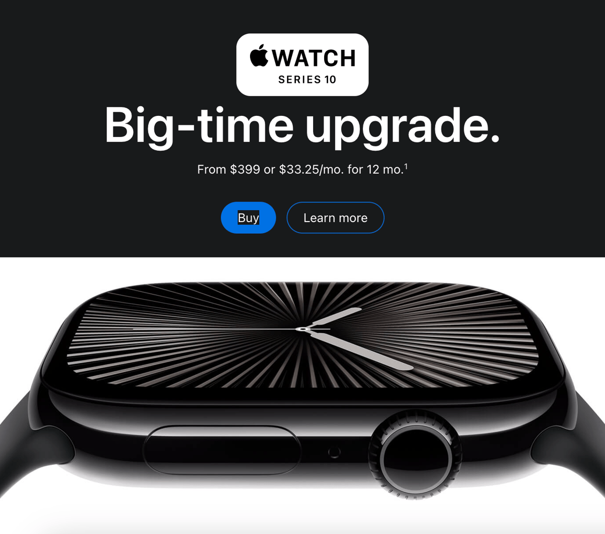
The third option is to turn the entire header section into a single image. The logo, the nav links, the spacing, all of it baked into one PNG or JPG. Images don’t get color-inverted, so the header renders exactly as designed in every client. The tradeoff is that you lose the accessibility benefits of HTML text in the header (and you add an asset to manage), so this is the heaviest option. It’s still a reasonable move for a small header area where the content rarely changes.
Use solid-fill buttons, not ghost buttons. Ghost buttons (a border with a transparent fill) tend to invert weirdly. Sometimes the border disappears. Sometimes the text and border end up matching the background. Use solid-filled CTA buttons with high-contrast text inside, ideally with the brand color sitting inside an image if it matters that much. Your CTA is the most important pixel in your email; do not let it negotiate with Gmail.
Reach for slightly heavier font weights. Thin fonts can be hard to read against dark backgrounds, especially on small mobile screens. If your body text is currently set in a 300 or 400 weight, try 500 in your dark mode CSS. The reading comfort improves and the design still feels modern.
Avoid pure white and pure black for body areas. Not because they “trigger” inversion (every color triggers inversion), but because they don’t read well at the extremes. Pure white on pure black is harsh on the eye in dark mode, which is the opposite of what dark mode users are choosing the setting for. Off-whites and near-blacks land softer in both directions.
Working inside Klaviyo
Here’s the thing nobody quite tells you about Klaviyo. The drag-and-drop builder doesn’t give you direct access to the template <head>, which is where dark mode meta tags and any custom CSS would normally live. Klaviyo’s own help doc confirms it: dark mode meta tags only kick in if you “include” them yourself, which Klaviyo doesn’t do automatically and the drag-and-drop editor doesn’t expose. The text blocks also strip and rewrite a lot of the inline CSS you paste in, which is why your HTML edits weren’t sticking.
So if you’re a Klaviyo agency, you basically have two paths.
Path 1: Stay in the drag-and-drop builder and lean entirely on design. Apply every tactic from the previous section. Brand colors inside images. White-outlined logos (or solid backgrounds, or full-image headers). Off-white body backgrounds. Near-black body text. Solid-fill CTA buttons. Slightly heavier font weights. You can ship a dark-mode-ready email this way without ever touching code. It won’t be pixel-identical across every client, but it’ll be readable and on-brand in all of them, which is the actual goal.
You can also build “Master Header” and “Master Footer” snippets in Klaviyo’s universal content blocks with the dark-mode-friendly treatments baked in. Every campaign and flow that references them inherits the standards. When you discover a new quirk six weeks from now, you fix it in one place.
Path 2: Get access to the email head. If you want the meta tags or real CSS overrides, you have three options:
- Hire an email developer to build custom-coded HTML templates for your clients. The most expensive option, but it gives you full control over every byte of the email.
- Use an external drag-and-drop builder like Stripo that exposes the head and lets you add dark mode CSS before exporting the HTML into Klaviyo as a custom template.
- If you (or your designers) work in Figma, the Email Love Figma Plugin lets you design emails in Figma, add iOS-specific dark mode styling, and inject dark mode CSS into the head, then export production-ready HTML that drops straight into Klaviyo as a custom-coded template.
A simpler testing approach
You’re already using Email on Acid, which is the right tool. Just test smarter, not more.
Send your campaign to yourself with dark mode enabled on every device you can. Open it in Apple Mail on iPhone. Open it in the Gmail app on iPhone. Open it in the Gmail app on Android if you can. Send it through Email on Acid or Litmus to see Outlook desktop without owning a Windows machine.
If you want a fast, free first-pass check, Proofjump’s dark mode simulator lets you preview your email in dark mode across clients without an account or a paid subscription. It’s perfect for catching the obvious failures (vanishing logos, destroyed brand colors, dead CTAs) before you spend a credit on Email on Acid or Litmus.
What you’re looking for, in priority order:
- Is the logo still visible? Most common failure.
- Is the CTA still readable and clickable? Second most common.
- Does the body text contrast hold up? It will if you started with strong contrast.
- Does any brand-critical color get destroyed? Watch the yellows, the bright greens, and the pale pinks.
- Does anything look broken, mismatched, or unprofessional? A general gut check.
If the answers are yes, yes, yes, no, and no, ship the email. Don’t spend Friday night trying to make it pixel-identical across clients. That email won’t exist. The one that’s readable and on-brand in both modes will.
How real teams are handling this in 2026
A few patterns we see across the lifecycle teams we work with, including the brands we build design systems for.
Most have stopped treating dark mode as a QA pass and started treating it as a design constraint. The color choices that survive dark mode are made in Figma, not patched in Klaviyo. Sarah Gallardo at Stitch makes this point well: the biggest issue with dark mode isn’t technical, it’s organizational. By the time the email is built, the dark mode problems are already baked in.
Brand teams are revising their style guides to specify a light/dark color pair for every brand color. The light value is what shows up in the light mode version. The dark value is what shows up in the dark mode CSS. When a client refreshes their brand, you update one document and the templates inherit the change.
The teams that are happiest with dark mode are the ones that gave up on parity. They accept that the email will look slightly different in Apple Mail than in Gmail iOS than in Outlook desktop, and they make peace with it. Their rule is “readable and on-brand in every client,” not “pixel-identical in every client.”
The three things to do this week, if you read nothing else
- Rebuild your logo with a transparent background and a 1 to 2 pixel white outline (or a baked-in background, or a full-image header). Drop the new version into your Klaviyo master template. Logo visibility problem: solved.
- Pull every pure white (
#FFFFFF) and pure black (#000000) out of your template and replace them with off-whites and near-blacks. Backgrounds, text, everything. This is a 20-minute exercise that recovers most of your dark mode behavior. - Decide which Klaviyo path you’re on. If you’re staying in the drag-and-drop builder, double down on the design tactics above and stop trying to inject CSS into text blocks. If you want real control over dark mode, plan to move to custom-coded templates (via a developer, Stripo, or the Email Love Figma Plugin).
Hope that helped!
Got a question like Keri’s?
This is the second post in our new Reader Mail series. Every month, we’ll answer one real question from one real email marketer trying to ship better campaigns. If you’ve got a question, hit reply on our next newsletter or send it to [email protected]. We read everything.
And Keri, thanks for sending this in!
Much love,
Andy

Andy has spent two decades building email programs for brands and agencies, and now co-runs Email Love: the inspiration gallery of 577,000+ emails and the Figma plugin that lets teams design, build, and export production-ready email without leaving their design file. He writes about email design systems, production workflow, and where the industry is heading.

Customer.io delivers more impact from every message–unifying data, messaging, and AI into one platform so every customer interaction gets smarter over time. We help teams build personalized campaigns across email, SMS, push, in-app, and webhooks, using their own first-party data to reach the right people with the right message at the right moment. AI is built into the platform to remove the grunt work, letting marketers focus on strategy, not setup. Over 9,000 brands trust us to power their messaging.