On this page · 10 min read
Every December, the same thing happens. Spotify drops its Wrapped campaign, it goes viral, and every marketer immediately thinks: “We should do that!”
Then reality sets in. You don’t have listening hours. You don’t track user streaks. You sell a beverage/cosmetics/apparel, not subscriptions. Your data looks more like “total cases sold” and less like “you listened to indie folk at 2am on 47 Thursdays.”
So you skip it.
But here’s what most people miss: Spotify Wrapped doesn’t work because it’s personalized. It works because the data is interesting. It tells you something you didn’t know. It makes you feel something. Sometimes it’s pride (“top 1% of listeners!”), sometimes it’s surprise (“I listened to that song HOW many times?”), sometimes it’s just fun to share.
The personalization is just the delivery mechanism. The hook is the data itself.
Which means if you can find data that’s interesting, surprising, or share-worthy, you don’t need it to be personal at all. You can send a killer wrapped email using only company-level stats. The brand’s year. The community’s impact. The products that won.
And honestly? For many brands, this actually works better.
Why Collective Data Actually Hits Different
Here’s what I’ve noticed looking through all of the wrapped emails from the last few years: the best ones make you feel like you’re part of something bigger.
Take this line from Naked Life Spirits: “4.8 Million enhanced drinking moments chosen.”
Is that about you specifically? Nope. But if you bought their non-alcoholic spirits this year, you’re part of that 4.8 million. You contributed to that number. There’s something weirdly satisfying about that.
Or Athletic Brewing’s callout: “$6.3 Million donated through our partnerships.”
Again, not your personal donation. But if you’re a customer who chose them partly because of their mission, that number validates your choice. It says “the brand you decided to support is actually making a difference.”
This is the thing people forget: your customers care about your story too. They want to know if the brand they chose is winning. They want proof that their purchase decision was smart. They want to feel like they backed the right horse.
Company milestones give them that validation.
What Data You Actually Have (And Why It’s More Interesting Than You Think)
Let’s talk about what’s sitting in your analytics right now that could make a killer wrapped email.
Your Sales Data Is More Fun Than You Think
LSpace nailed this: “3,133,913 – You shopped. We counted.”
It’s just their order count for the year. But the way they presented it (huge number, cheeky copy) made it feel significant. They didn’t overthink it.
Same with their “Add to Cart Game Was Strong: 1,571,139” stat. That’s literally just cart adds. But framing it as a game score makes it playful instead of corporate.
The key is making big numbers feel real. Compare them to something tangible. Gardyn did this beautifully: “62,452,293 gallons of fresh water saved from lakes and rivers or 833K average sized bathtubs.”
Now I can actually picture 833,000 bathtubs. That’s a visual. That’s share-worthy.
Best Sellers Write Themselves
Health-Ade led their wrapped email with their top 3 kombucha flavors of the year:
- Ginger Lemon
- Cayenne Cleanse
- Pink Lady Apple
Then they showed the actual product bottles in a beautifully designed section. Simple. Effective. Gives customers that “I KNEW Ginger Lemon was the best one” validation.
LSpace did the same thing with their top-selling bikinis. Just images of the five best sellers with their names. No complex data visualization needed. The products are the story.
This works especially well if you launched something new this year. Health-Ade called out their Mango Lemonade launch and included poll results: “over 14,000 of you tried it! Maybe we should bring this seasonal favorite back for another go?”
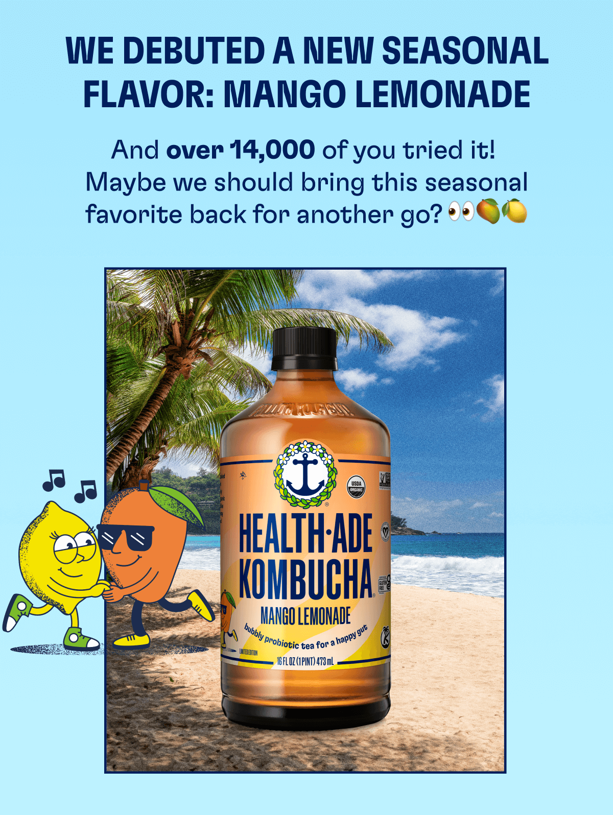
See what they did there? They used the data to tease future products AND made customers feel heard.
Social Impact Data Hits Different Right Now
People want to know their money is going somewhere good. If you’ve got impact metrics, lead with them.
Harmless Harvest crushed this with their Fair For Life impact section:
- 100,000 beneficiaries supported since 2015
- 9 total projects supporting 13,000+ beneficiaries in 2025
- 2,600+ school bags distributed to 221 schools
- 2,308 pieces of protective gear for farmers and workers
That’s not customer data. That’s company data. But it makes their customers feel like they’re funding something meaningful every time they buy a coconut water.
Spinn Coffee did this with their wrapped email showing total brewing stats: “3.5M coffees, 3.2M espressos, 408K cold brews” brewed through their machines in 2024.
Then they broke down the savings: “$6.8M saved compared to coffee at a cafe” and “8.6k lbs less waste in the landfills.”
None of that is personalized to individual customers. But if you bought a Spinn machine, you’re part of those numbers. You contributed to keeping 8.6k pounds of waste out of landfills. You’re one of the people who brewed 3.5 million cups of coffee at home instead of buying it out. That collective impact makes you feel good about your purchase.
Your Company Milestones Matter More Than You Think
Cymbiotika led with “2024 in the Rearview Mirror” and included their team photo right at the top. Then they wove in accolades throughout:
- Featured in Forbes, Mother, Vogue
- Named Wellness Company of the Year
- Best Place to Work (LA)
Is this about the customer? Not directly. But it reinforces that they made a good choice supporting this brand. These aren’t just supplements, they’re award-winning supplements from a company people want to work for.
Hearth took a similar approach, highlighting major product launches (iOS and Android apps, calendar messaging, profile streaks) alongside company achievements (press coverage, hitting 312 new reviews).
The message is clear: “We’re growing, we’re innovating, and you’re along for the ride.”
Don’t Sleep on Social/Cultural Moments
LSpace included their La Jolla UTC store opening as a major highlight, complete with an embedded Instagram post showing the launch event.
For customers in that area, that’s huge news. For everyone else, it signals growth and success. Either way, it’s a milestone worth celebrating.
Athletic Brewing did this even better by creating distinct sections for major partnerships and initiatives:
- Arsenal partnership announcement
- Walker Hayes collaboration
- “It’s Athletic. Ask For It.” campaign launch
- 11,800+ new retailers added
Each one got its own card with imagery. Each one told a story beyond just “we sold more beer.”
Design Approaches That Actually Work
After looking at dozens of these, a few formats keep showing up because they just work.
The Visual Comparison Approach
This is where those “equivalent to X bathtubs” or “the weight of 7.4 jets” comparisons come in.
Gardyn used bathtub icons to visualize water saved. They used plane icons for pesticides eliminated. They used car icons for food waste avoided.
It sounds cheesy, but it works because our brains can’t really process “62 million gallons” without a reference point. We CAN picture 833,000 bathtubs (even if that’s still absurdly large).
Spinn Coffee nailed this with their waste impact section. They showed “11.5M pods saved from going in landfills” visualized as an actual wall of coffee pod icons, then translated that into “Over 800 football fields.” Now you can actually picture the scale of impact. That’s way more powerful than just saying “11.5 million pods.”
The Product Grid
Health-Ade and LSpace both used this beautifully. Just a clean display of your top products with minimal text.
Health-Ade numbered theirs (1, 2, 3 for top flavors). LSpace added the product names. Both included high-quality product photography.
Cymbiotika took it up a notch with their “Most-Loved Products” section. They created a numbered grid (1-4) with beautifully styled product photography on colored backgrounds. Each product got its own visual moment: Liposomal Magnesium on a blue background with almonds, Vitamin C on orange with fresh oranges, Glutathione on orange with citrus. The styling made the products feel premium and the numbered ranking made you curious which one was #1.
Lull kept it simple with “Lull’s Top Products” and a straightforward vertical list numbered #1-5. Each product got a lifestyle photo, the product name, and a “Shop Now” CTA. Nothing fancy, but the ranking itself creates engagement. You want to see if the mattress you bought made the top 5.
Why this works: Your customers already know these products. They don’t need descriptions. They just want to see if their favorite made the list. It’s like seeing your song on someone’s top 10 list. Instant engagement.
The Narrative Timeline
Mosh took a literal timeline approach with key moments from each month plotted on a vertical line: May (MOSH is on Shark Tank), June (New Look + Smarter Formula), June (Now at Sprouts), December (Donated over $200,000 to Alzheimer’s Research), December (Sold over 3.25 million bars). The visual format made it easy to see the year’s progression at a glance.
Wandering Bear went with a celebratory “Raise a Glass: Here’s to 2024!” approach and built their story in sections: improved membership program, more product drops than ever, expanded to 2,000+ locations, then closed with “a few of our most ‘this is so fun’ moments” featuring collaborations with Brewhon, MALK, PopUp Bagel, and others. Each partnership got a photo and a brief description, creating a montage of wins throughout the year.
Both approaches work because they create a narrative arc. You’re not just throwing random stats at people. You’re telling the story of your year with a beginning, middle, and end.
What Not to Do (I’ve Seen All These Mistakes)
Don’t use data just because you have it.
Your subscriber count probably isn’t interesting unless it hit a major milestone. Your email open rate definitely isn’t interesting to your customers (that’s insider baseball).
Don’t bury your best stat.
If you donated $6 million, lead with that. Don’t put it in section four after your new office plants and updated logo.
Don’t make yourself look small if you’re early stage.
If you only have 50 customers, maybe don’t lead with “50 amazing customers!” Instead, focus on growth (“+300% year over year”) or impact per customer (“Helped 1,000 families save an average of $2,400 on groceries”).
Skip the corporate speak.
The second I see “stakeholder engagement” or “strategic initiatives” in a wrapped email, I’m out. This is supposed to be fun. Write like a human.
Don’t forget the visuals.
A wall of numbers is boring. Every stat needs a visual element. Product photo, icon, illustration, comparison graphic, something.
Your Quick “Do We Have a Wrapped Email?” Framework
Not sure if you have enough for a wrapped email? Run through these questions:
What number would make our customers say “whoa”?
(Total impact, units sold, miles driven, trees planted, whatever)
What achievement would make them proud to support us?
(Awards, press, partnerships, milestones)
What product or moment defined our year?
(Launches, viral moments, bestsellers)
What impact did we create together?
(Donations, sustainability wins, community initiatives)
What surprised us this year?
(Unexpected bestseller, customer behavior, growth in weird category)
If you can answer three of those five questions, you’ve got enough for a wrapped email.
Putting It All Together: Your Structure
Here’s the basic flow that works:
Hero Section
Your biggest, best stat or a strong “Year in Review” headline. Make it visual. Make it bold.
Section 1: The Stat That Makes Them Feel Something
Usually your impact number or your growth number. The one that says “we did something significant this year.”
Section 2: The Products
What sold, what launched, what people loved. Keep it visual.
Section 3: The Milestones
Company achievements, press, awards, expansion. Stuff that proves you’re legit.
Section 4: The Impact
If you have social impact metrics, put them here. If not, this could be customer stories or community highlights.
Section 5: Looking Forward
Brief tease of what’s coming in 2025. Keep it light. This email is about celebrating, not selling.
Close
Simple thank you. Minimal CTA. Maybe a soft product link if it feels natural, but don’t force it.
Real Talk: You’re Overthinking This
Some of the best wrapped emails I have seen aren’t the most complex. They were the most honest.
Athletic Brewing literally just showed their year in cards. Each partnership, each milestone, each achievement got a simple card with an image and a sentence or two. No fancy data visualization. No interactive elements. Just “here’s what we did, and we’re proud of it.”
Health-Ade celebrated their kombucha flavors like they were announcing Oscar winners. They made their seasonal launch feel like an event by showing how many people tried it.
Naked Life Spirits focused entirely on the collective impact their customers created by choosing non-alcoholic options. Every stat was framed as “we did this together.”
None of them needed personal data to work. They just needed interesting data and the confidence to present it well.
Your Move
You don’t need a Spotify-level user dashboard to send a wrapped email. You need three good stats and the willingness to celebrate them.
Your customers want to know how the year went. They want to feel like they were part of something. They want validation that supporting your brand was the right call.
Give them that.
And if you need inspiration, we’ve got an entire collection of wrapped emails from the last few years. The patterns are all there. You just have to adapt them to your story.
Want to design a wrapped email that doesn’t look like everyone else’s? The Email Love Figma Plugin lets you create custom email designs and export them as production-ready code for any ESP. Try it for free here.
Much love,
Andy

Andy has spent two decades building email programs for brands and agencies, and now co-runs Email Love: the inspiration gallery of 577,000+ emails and the Figma plugin that lets teams design, build, and export production-ready email without leaving their design file. He writes about email design systems, production workflow, and where the industry is heading.

Customer.io delivers more impact from every message–unifying data, messaging, and AI into one platform so every customer interaction gets smarter over time. We help teams build personalized campaigns across email, SMS, push, in-app, and webhooks, using their own first-party data to reach the right people with the right message at the right moment. AI is built into the platform to remove the grunt work, letting marketers focus on strategy, not setup. Over 9,000 brands trust us to power their messaging.