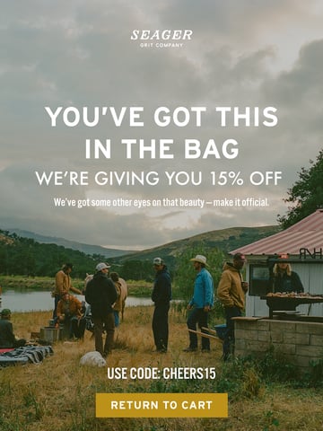
Disclaimer: Bite own the rights to all content, images and design of this email. The above email has been featured on Email Love because I (Andy King) think it is a great reference to cart abandonment email design. So things don’t get messy on the email author’s end: I’ve stripped out all the email tracking pixels, campaign links and hosting all the images myself. Read more Email Love legal information.
Email Inspiration from Bite
Love what Bite has done here! The hero image cleverly plays on FOMO with “Waiting for a sign?” while the abandoned cart email stays fresh with a clean, minimalist design. The product photography pops against that earthy header, and those animated sustainability icons add just enough movement without overwhelming. Smart use of white space around the “THIS IS IT” CTA creates visual hierarchy that guides the eye perfectly. Dig the cohesive social proof integration too. ?