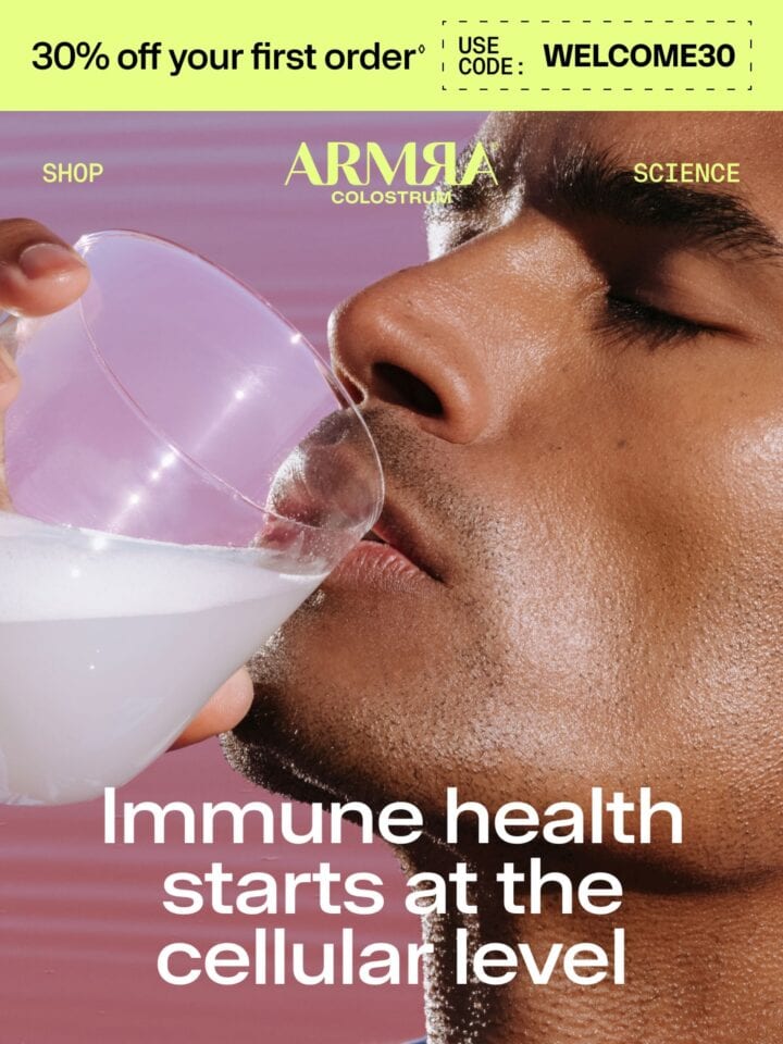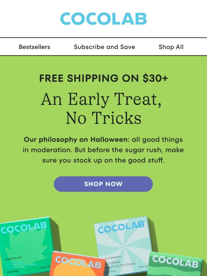
Disclaimer: quip own the rights to all content, images and design of this email. The above email has been featured on Email Love because I (Andy King) think it is a great reference to healthcare & wellness and health email design. So things don’t get messy on the email author’s end: I’ve stripped out all the email tracking pixels, campaign links and hosting all the images myself. Read more Email Love legal information.
Comment on emails with your team
Start a team, @mention teammates on any email and share collections. It's free, and only your team sees it.
Similar Email Inspiration
Get the 2026 report
Ad
Data from 750+ marketers