

Disclaimer: Tuckernuck own the rights to all content, images and design of this email. The above email has been featured on Email Love because I (Andy King) think it is a great reference to apparel and fashion and welcome email design. So things don’t get messy on the email author’s end: I’ve stripped out all the email tracking pixels, campaign links and hosting all the images myself. Read more Email Love legal information.

This is a good-looking email. See how it stacks up technically with previews of four common inboxes, including light mode and dark mode.
Previews
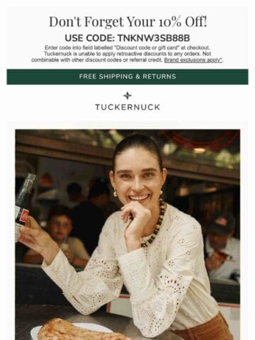
iOS 18 Mail
iPhone 16
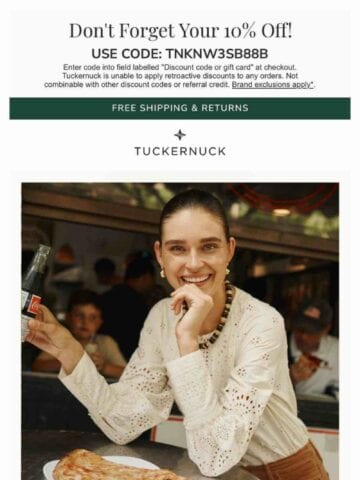
iOS 18 Mail
iPhone 16 dark
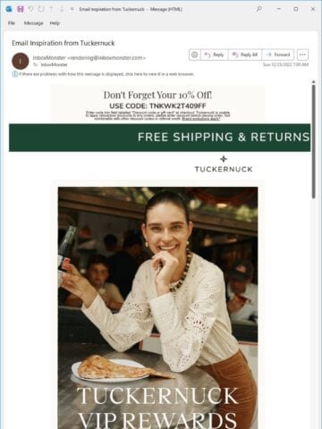
Outlook 365
Windows 2022
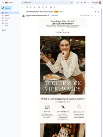
Chrome Gmail
Mac Ventura

