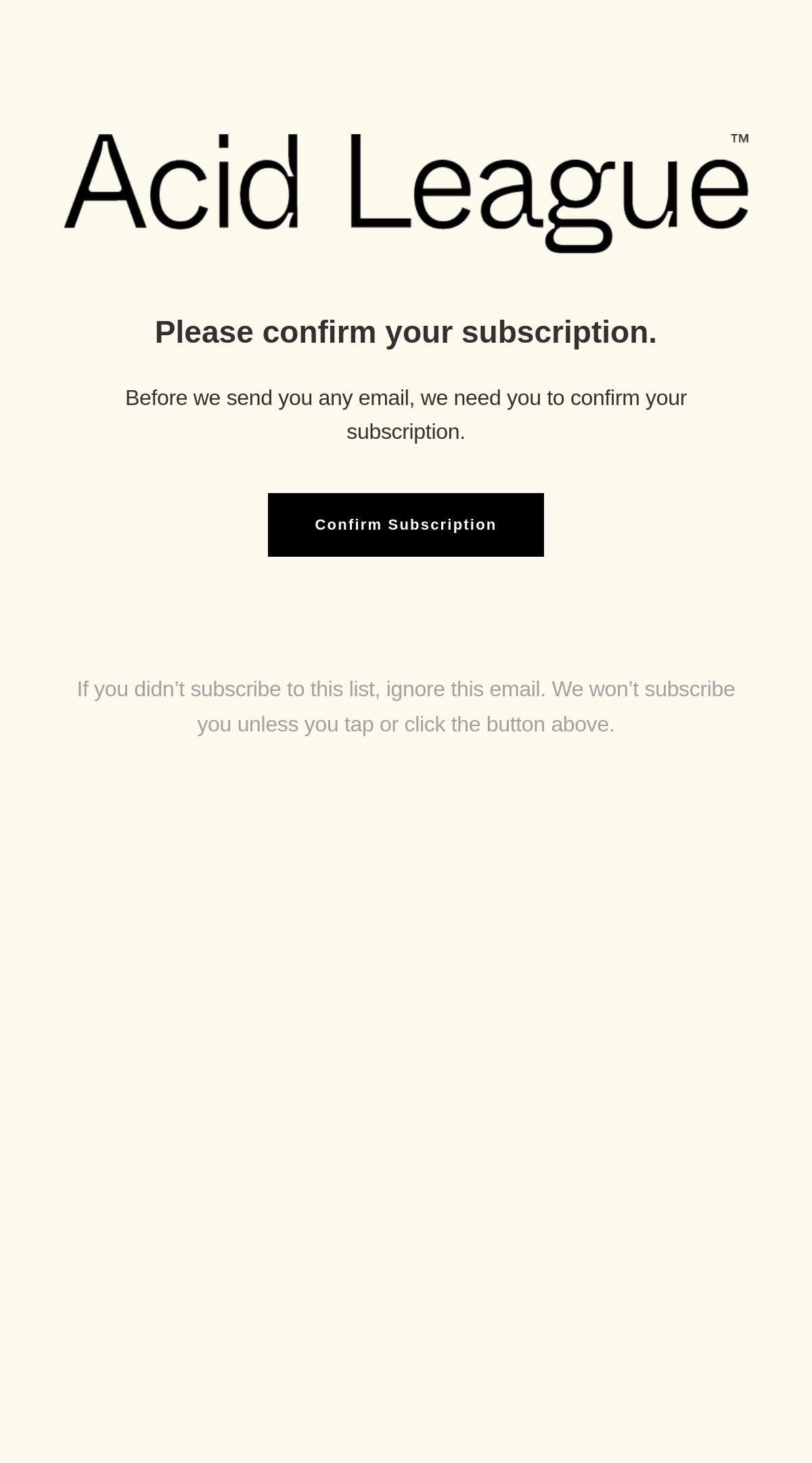
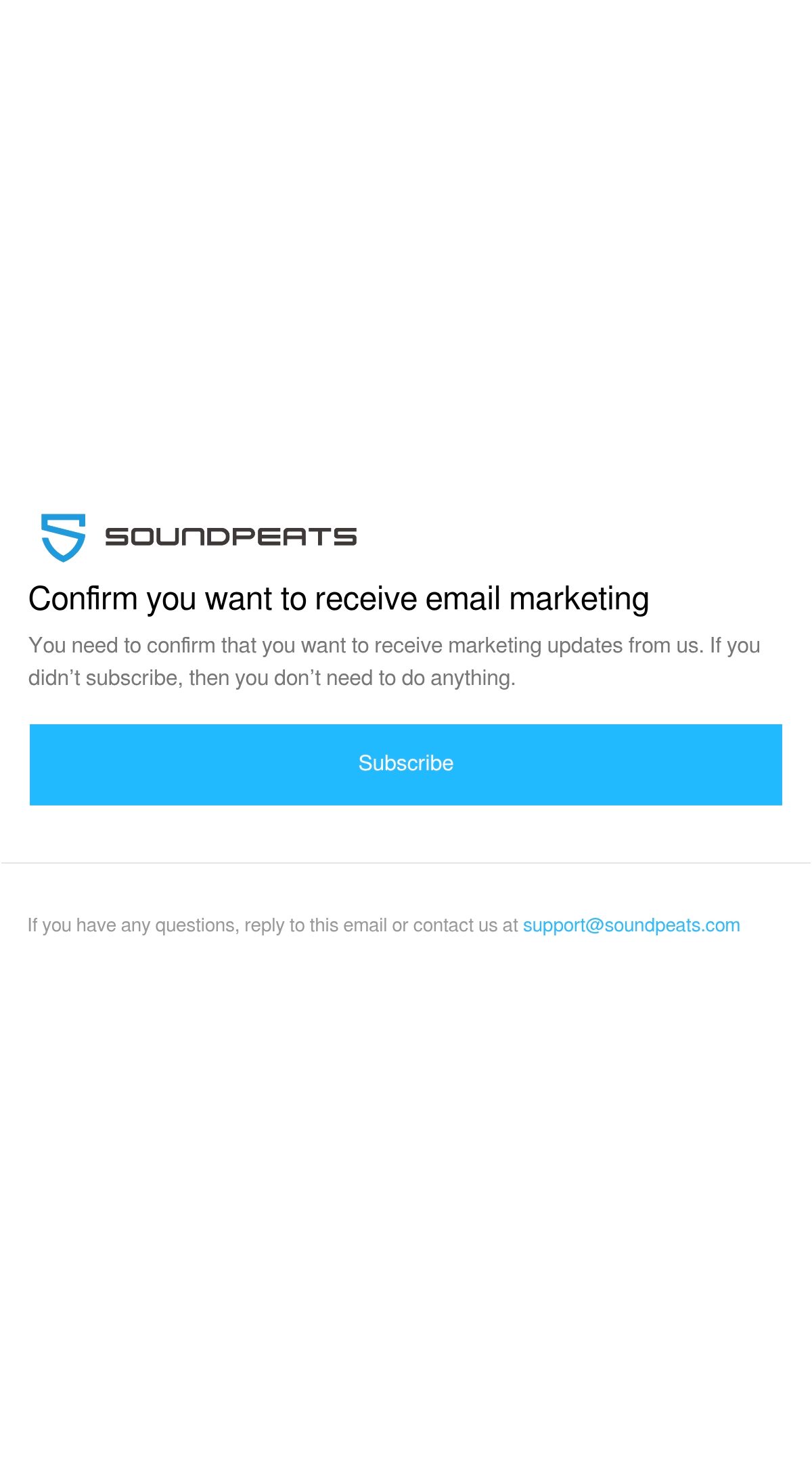
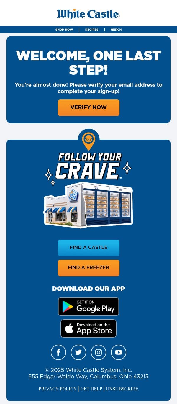
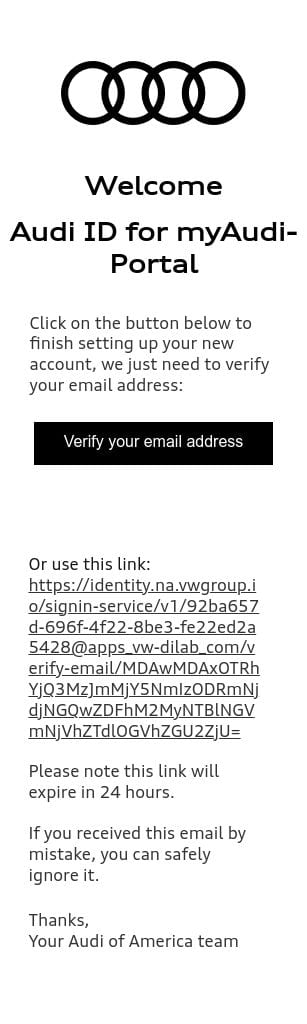
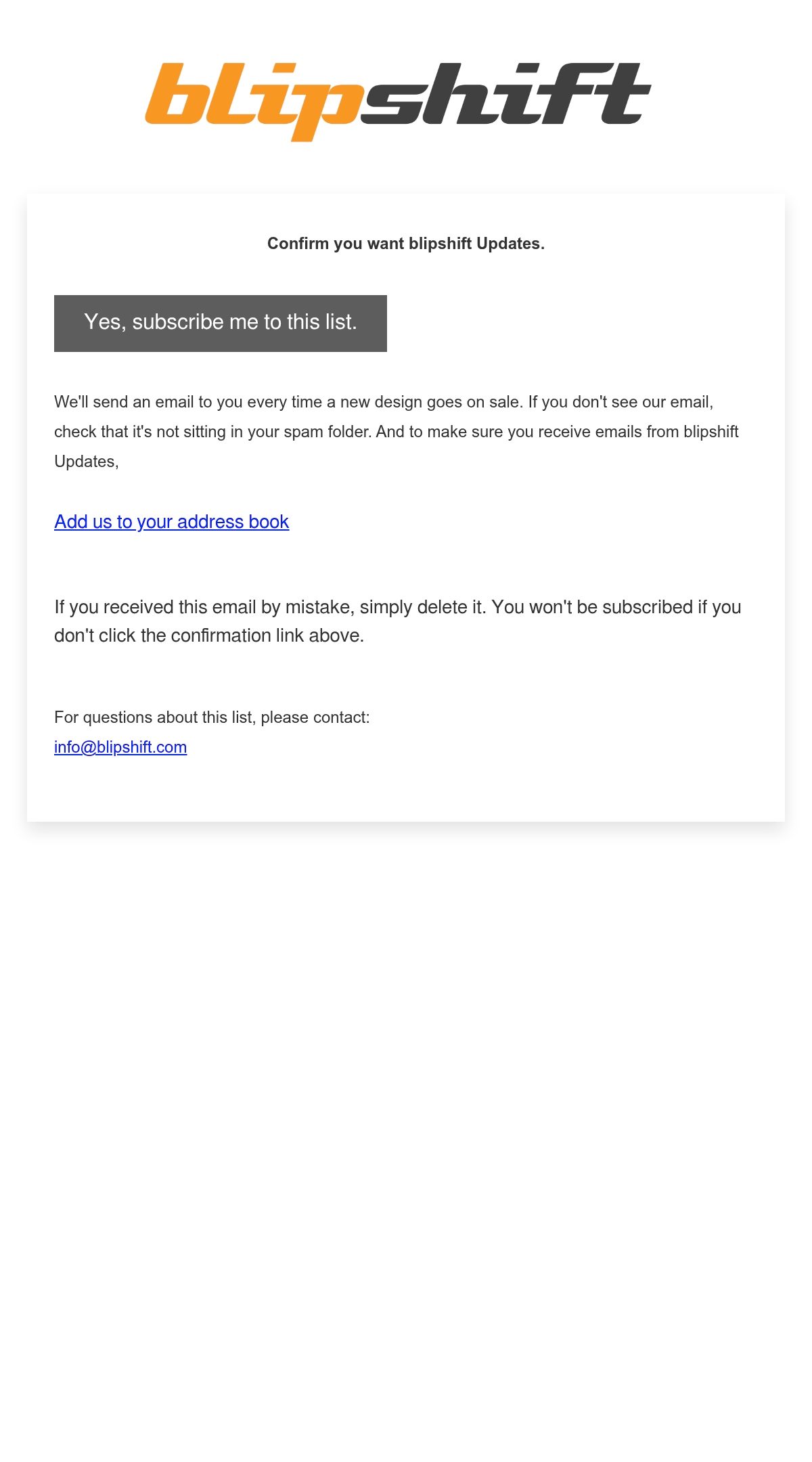
A verification email asks the subscriber to prove the address is theirs: double opt-in confirmations, account activations, and one-time codes. It is often the most-clicked email a brand ever sends, because the reader cannot proceed without it, and the best ones honor that intent with one unmissable action and zero distractions.

Verification emails ask the reader to prove an address is theirs: double opt-in confirmations, account activations, and one-time codes. They are the highest-intent messages in email, because the subscriber cannot continue without clicking, and this hub collects the sends that respect that moment.
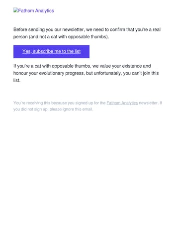
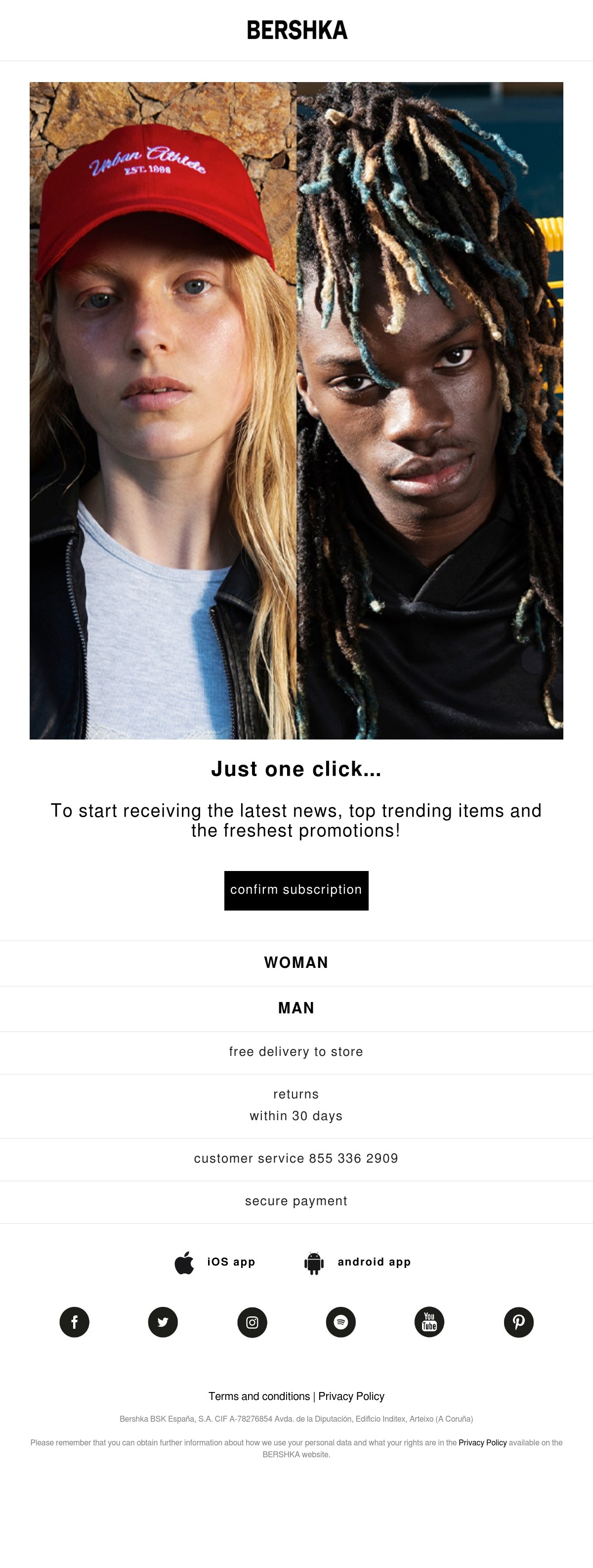
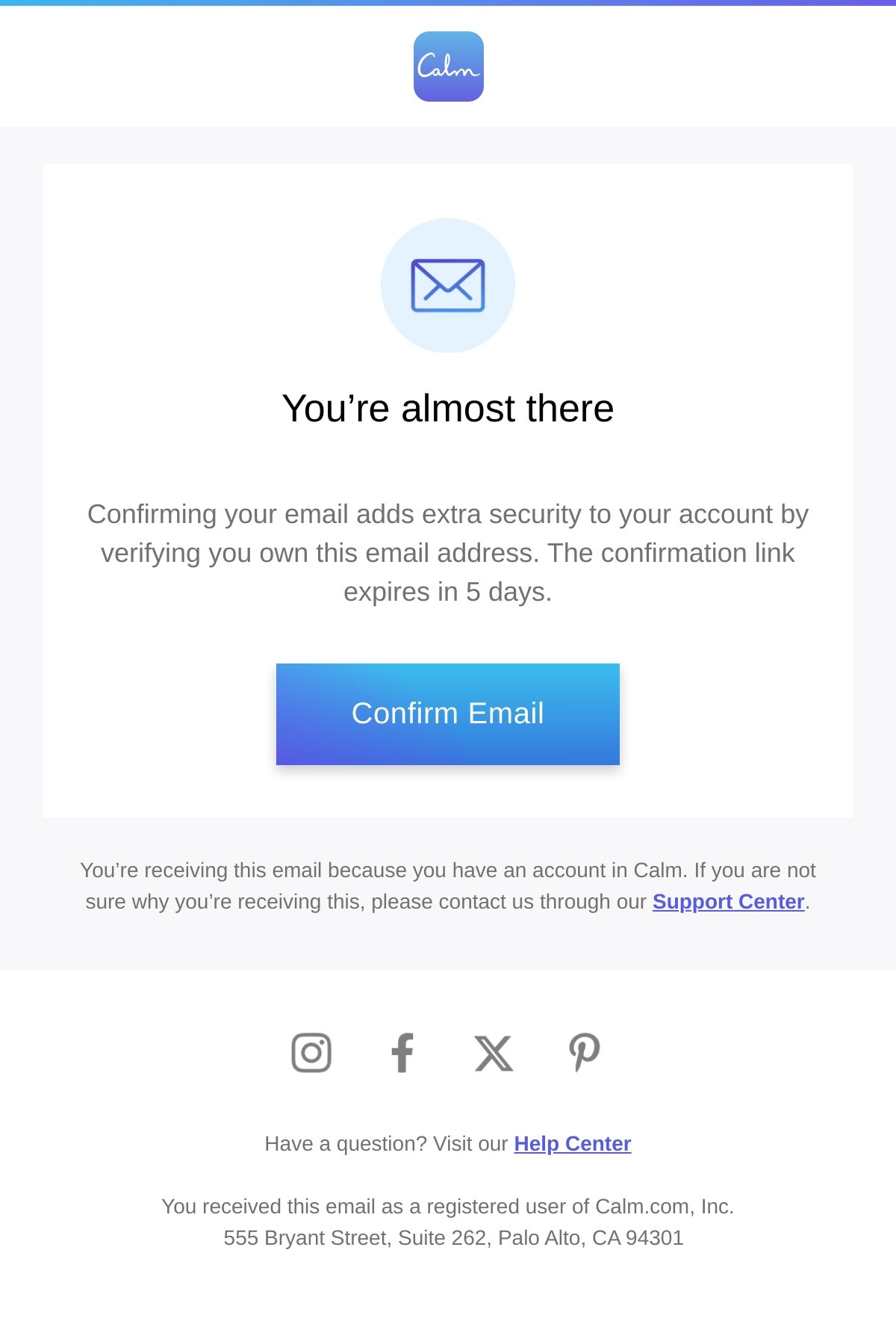
The winning anatomy is austere: one sentence of context, one unmissable button, and nothing else competing. The strongest examples in the grid arrive within seconds, repeat the action in plain text for image-off clients, and skip promotion entirely, because a confirmation email that sells something erodes the trust it exists to establish.
Double opt-in itself is a strategy choice: it trims list growth slightly but yields cleaner engagement and better deliverability, which is why so many of the brands here use it. See what comes immediately after in welcome emails, and the broader functional family in transactional emails.
Ranked by real reader views on Email Love over the last 90 days.
Pulled verbatim from sends in this collection. Every line links to the actual email it opened.
What the sends in this collection actually do, measured from our own archive.
Subject stats from 374 curated verification emails; word and image stats from the 173 analyzed sends.
An automated message that asks the recipient to confirm ownership of an email address or account: double opt-in confirmations, activation links, and one-time codes. It gates whatever the person just signed up for, which makes it the rare email with near-guaranteed attention.
Usually. You lose a slice of signups who never confirm, but everyone who remains is verified and engaged, which lifts deliverability and keeps spam traps and typos off the list. Brands in regulated markets or with deliverability problems benefit most.
The minimum: who it is from, one line saying what to confirm, a single prominent button, a plain-text fallback link, and an expiry note if the link times out. No offers, no navigation, no secondary content; the email has exactly one job.
Because speed and clarity beat beauty here: they must render instantly everywhere, survive image-blocking, and leave zero doubt about the action. The best ones still carry the brand through type and a logo, but the design goal is frictionless completion, not inspiration.
Designing your verification email?
Design it in Figma and export production-ready HTML straight to your ESP with the Email Love plugin. Build it in Figma →