
The Best 28 Charts Email Examples in 2026
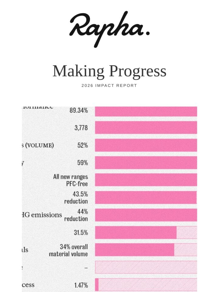
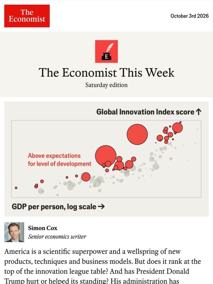
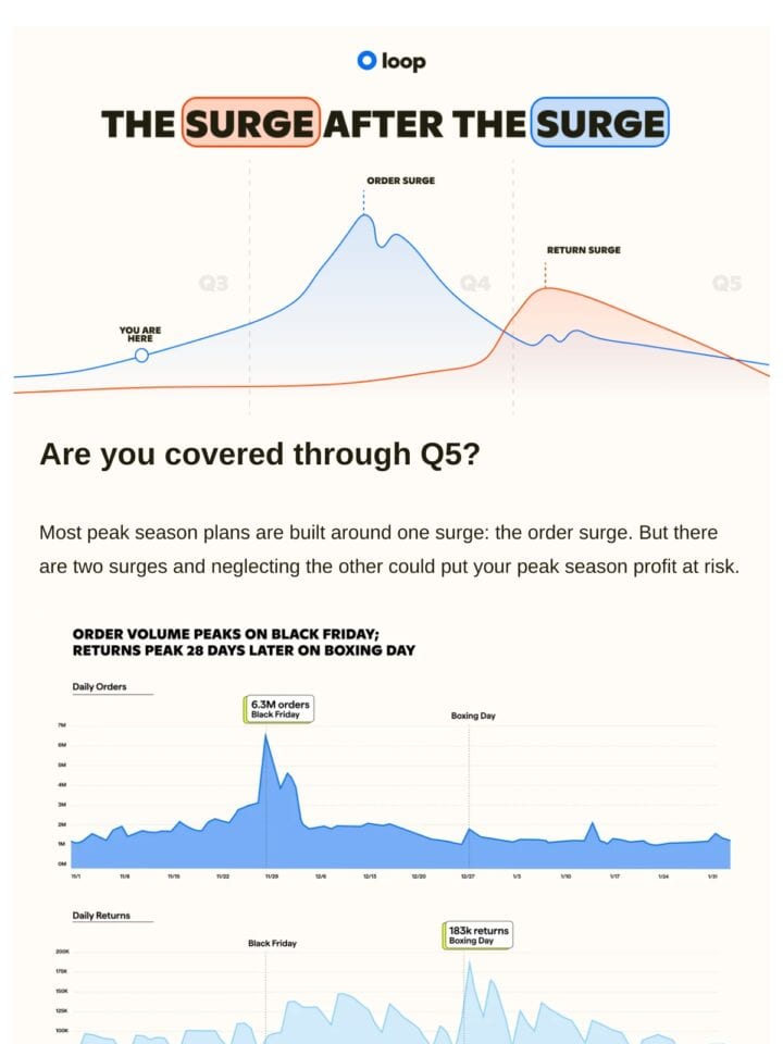
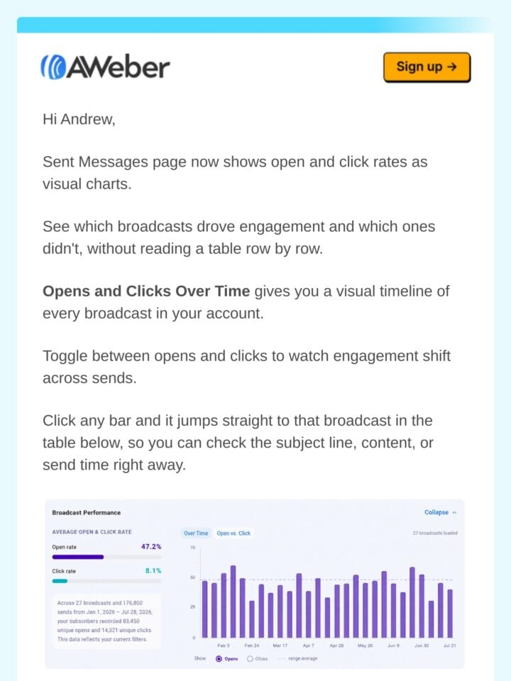
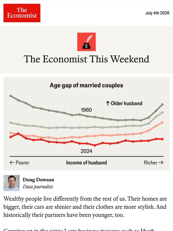
Charts turn abstract numbers into something readers grasp in a glance: progress bars, bar graphs, year-in-review stats, or simple data viz that proves a point fast. The strongest examples keep it legible at mobile width, use color to guide the eye rather than decorate, and pair the visual with a clear takeaway. Watch for charts rendered as crisp images with alt text, since live SVG and tiny labels often break in inboxes.

Curated emails
28
Brands featured
12
Newest addition
Jan 2026
View


Get the 2026 report
Ad
Data from 750+ marketers
January 8, 2026
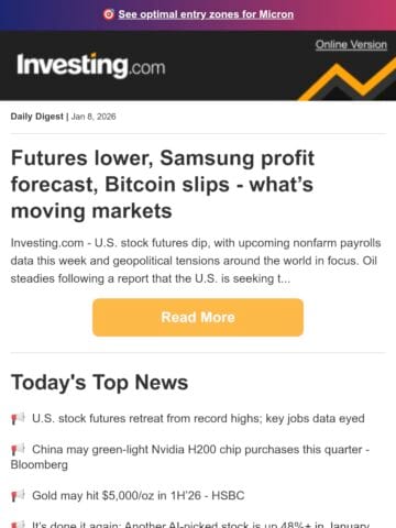
🟠 Futures lower, Samsung profit forecast, Bitcoin slips - what’s moving markets
Oracle ResponsysGIF
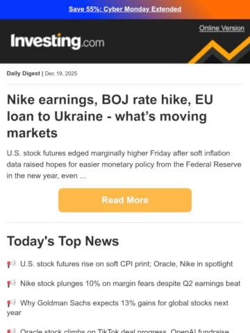
December 19, 2025
🟠 Nike earnings, BOJ rate hike, EU loan to Ukraine - what’s moving markets
Oracle ResponsysGIF
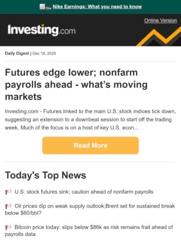
December 16, 2025
🟠 Futures edge lower; nonfarm payrolls ahead - what’s moving markets
Oracle ResponsysGIF

