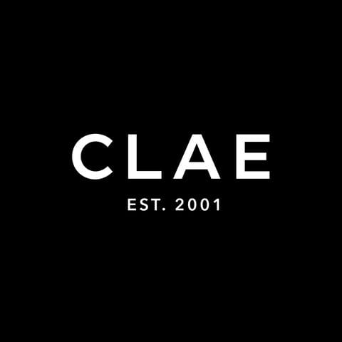
Email Inspiration from CLAE

We’re loving how this email from CLAE nails sophisticated minimalism! The hero image instantly draws you in with that sleek Vibram sole detail, while the 2×2 product grid keeps the focus tight on the shoes. The earthy brown CTA buttons provide perfect contrast against the clean white backdrop, and that centrally-aligned “LESS IS MORE” tagline really drives home the premium positioning. Top marks for the justified product copy – makes the technical details feel polished and intentional.

Disclaimer: CLAE own the rights to all content, images and design of this email. The above email has been featured on Email Love because I (Andy King) think it is a great reference to ecommerce email design. So things don’t get messy on the email author’s end: I’ve stripped out all the email tracking pixels, campaign links and hosting all the images myself. Read more Email Love legal information.

Want an email about emails every two weeks?

*the Email Love newsletter sends twice a month. Unsubscribe instantly. Pinky promise.

Similar Email Inspiration

Figma to ESP with 1 click

Loved by designers & marketers

Email Inspiration from Spyder Thumbnail Preview
Email Inspiration from ILIA Thumbnail Preview
Email Inspiration from Lacoste Thumbnail Preview
Email Inspiration from MACKAGE Thumbnail Preview