On this page · 4 min read
A subscriber recently asked where to find footer inspiration on Email Love. Good question – turns out I’ve been tagging my favorite examples for years, but they were kind of hidden.
So I added a direct link to the navigation. Under Trends, look for the foot emoji 🦶 and you’ll find a whole gallery of emails with footers worth studying.
Here are nine of my favorites and what makes them work.
Footers are one detail in a much bigger craft. For the full picture, browse more email design examples.
Why Footers Actually Matter
Let’s be honest – most people treat footers as an afterthought. Slap in the required legal stuff, add an unsubscribe link, call it done.
But here’s what’s interesting: footers get more clicks than you’d expect. When someone scrolls past your main offer, they’re often still interested in something. Your footer is that last chance to give them options.
A well-designed footer should include:
- Navigation to key website sections
- A visible unsubscribe link (never hidden in fine print)
- Social proof or social media links
- Contact info and preference management
Now let’s look at brands doing this well.
Sonos: The Minimalist Approach
Sonos keeps it minimal with large, stacked HTML text links separated by thin divider lines. Everything is easy to scan, and nothing feels cluttered.
The best part? The unsubscribe and privacy links are completely visible. No hunting required. It’s a sign of confidence when brands make it easy to opt out.
Simple execution, but really well done.
Floyd: Navigation-Heavy Done Right
Floyd takes the opposite approach – they pack their footer with options. Eight different product category links (bedroom, storage, hardware, tables), a referral program CTA, and an Instagram banner.
The only miss? Those product links are images instead of HTML text.
But the Instagram integration is smart. It adds social proof and gives people a reason to connect on another channel.
SeaVees: Category-Driven Navigation
Packlane uses HTML text with nice styling to create clear product categories. Women’s and Men’s sections each get Bestsellers and New Arrivals links, separated by visual dividers.
They also include helpful icons for Contact Us, Free Shipping, and Text Sign-Up.
One issue: the legal text is tiny. Maybe 10-11 point. There’s no reason to go that small – bump it to 12 point minimum for readability.
Packlane: Structured Categories
Packlane leads with Instagram, pulling in their latest posts before the actual footer content. It’s a natural transition that encourages cross-platform following.
The footer itself is straightforward – logo, key links (Inspiration, Customers, About), social icons, and legal stuff. Lots of white space makes it easy to process.
Sometimes restraint is the right move.
Chanel: Comprehensive Navigation
Chanel’s footer has more links than most, but they make it work through smart organization. Product categories (Haute Couture, Fashion, Eyewear) sit alongside service links (Store Locator, Book Appointment).
The two-column layout keeps things manageable, and the line spacing prevents it from feeling cramped. It all stacks nicely on mobile too.
If you’ve got a diverse product line, this approach gives people plenty of exploration options.
Herman Miller: Two-Column Efficiency
Herman Miller nails the balance between comprehensive and compact. Utility links across the top (Contact, Warranty, Track Order), then a two-column section with logo and legal info.
Social icons at the bottom finish it off.
Everything’s in HTML text, the spacing is generous, and nothing feels squeezed. It’s functional without being boring.
Aesop: Premium Aesthetic
Aesop’s footer matches their brand aesthetic – distinctive typography, thoughtful organization, and plenty of breathing room.
They section everything logically: product links, service options (book a consultation, corporate gifting), brand story content, and sustainability info.
Instagram and LinkedIn icons are brand-appropriate choices here instead of the usual Facebook/Twitter mix.
It’s comprehensive without feeling overwhelming.
Freaks of Nature: The Bold Logo Move
Here’s a trend I’ve been noticing from DTC brands: the oversized logo in the footer.
Freaks of Nature uses a big logo as a visual anchor, followed by HTML text links and clear dividers. The unsubscribe is well-separated and easy to spot.
I’m not entirely sure why the giant logo works, but it creates a strong endpoint. It says “you’ve reached the end” in a confident way.
Kizik: Logo as Statement
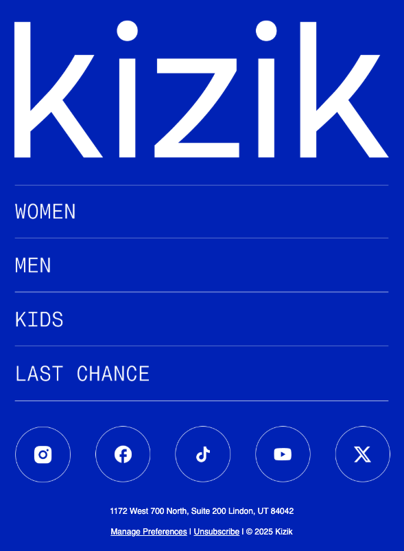
Kizik takes a similar approach with a really big logo in their footer. They include links to Men’s, Women’s, Kids, and Last-Chance Sale, all separated by dividers, plus nice-looking social media icons.
The only downside? It’s an all-image footer. It looks great, but HTML would work better for accessibility and load times.
Still, the layout and visual impact are solid.
Key Takeaways
After reviewing dozens of footers, here’s what consistently performs:
HTML text is better than images. Better accessibility, faster loading, works with images disabled. Just do it.
Readable font sizes matter. Keep legal text at 12 point minimum. Your lawyers might want it smaller, but your readers need to actually see it.
White space creates clarity. Even dense footers like Chanel’s work because they have proper spacing.
Make unsubscribing easy. It’s required anyway. Separate it visually, use adequate sizing, and don’t bury it.
Navigation drives clicks. Multiple website links give people options when your main offer doesn’t connect.
Check Your Data
I looked at our newsletter analytics. Social icons get minimal clicks, but our resource links (Ad Guide, Figma plugin, Submit Newsletter) see consistent traffic.
The footer isn’t just formality – it’s functional.
Pull your own analytics and see what’s actually getting clicked. You might find opportunities you’re missing.
One Last Thing
Browse the full footer collection at Trends → 🦶 on Email Love.
And if you’ve got a footer approach that’s working well for you, I’d love to hear about it.
Related: for the latest data on how brands are actually sending, see what we learned from 79,235 real emails.
Much love,
Andy

Andy has spent two decades building email programs for brands and agencies, and now co-runs Email Love: the inspiration gallery of 547,000+ emails and the Figma plugin that lets teams design, build, and export production-ready email without leaving their design file. He writes about email design systems, production workflow, and where the industry is heading.

Customer.io delivers more impact from every message–unifying data, messaging, and AI into one platform so every customer interaction gets smarter over time. We help teams build personalized campaigns across email, SMS, push, in-app, and webhooks, using their own first-party data to reach the right people with the right message at the right moment. AI is built into the platform to remove the grunt work, letting marketers focus on strategy, not setup. Over 9,000 brands trust us to power their messaging.