The Best 131 Monochrome Email Examples in 2026
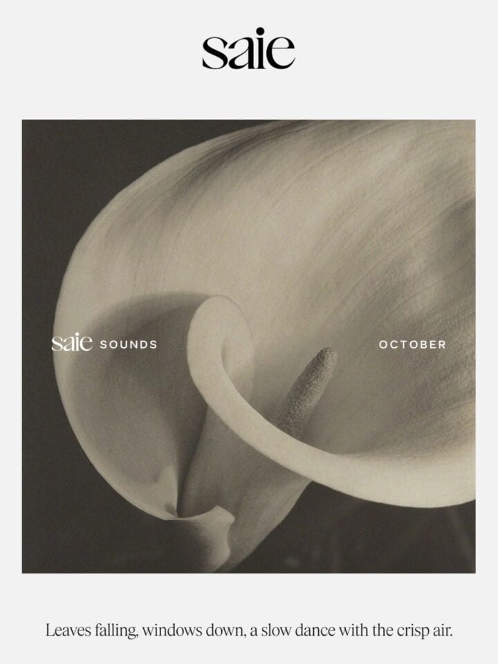
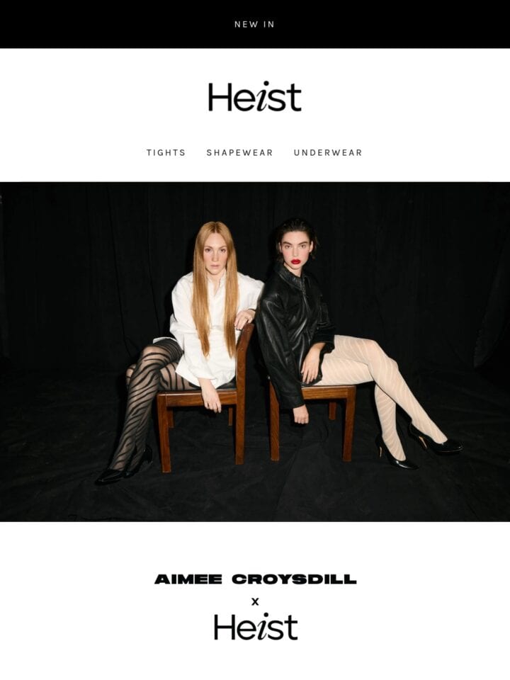
Monochrome emails commit to a single hue (or pure black, white, and gray), letting tone, contrast, and texture carry the design instead of color. Brands reach for it to signal restraint, luxury, or focus, often around product launches and editorial features. The strongest examples lean on typography, spacing, and imagery for hierarchy, and keep one accent reserved for the CTA so the click target never disappears.

Curated emails
131
Brands featured
51
Newest addition
Jul 2026
View





Get the 2026 report
Ad
Data from 750+ marketers

October 15, 2026
Lelu - A Monochromatic Metroidvania Launches January 21st, 2027!