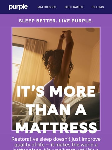
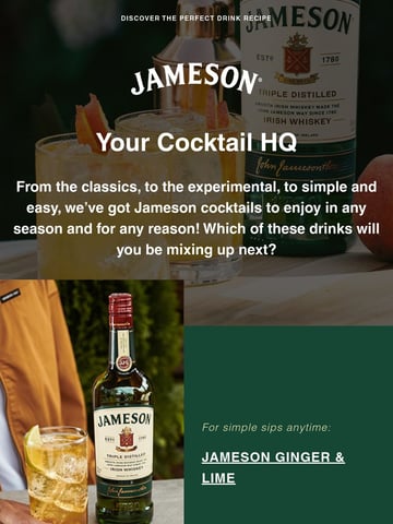
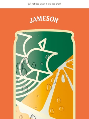
A dark mode optimized email is one built to render cleanly when a subscriber’s client inverts colors, so logos, text, and CTAs stay legible instead of disappearing into a black background. The best ones test across Apple Mail, Gmail, and Outlook, swap in transparent PNG logos with light outlines, avoid pure black or white, and never rely on color inversion to carry contrast.

Over half of email opens now happen in dark mode, and this hub collects the sends designed to survive it: emails that look intentional, not inverted, when the inbox flips to black.
The failure modes are familiar: black logos vanishing into black backgrounds, harsh auto-inversion of brand colors, white boxes glowing around transparent PNGs. The examples here defend against all three with transparent logos carrying subtle white outlines, mid-tone palettes that survive inversion, and designs tested in both modes before send.
The technical toolkit: @media (prefers-color-scheme) for clients that honor it, dark-safe transparent PNGs everywhere, and never trusting pure black or pure white. Some standouts go further and design dark-first, treating the dark inbox as the primary canvas. See the craft neighbors in interactive emails and the monochrome gallery.
Ranked by real reader views on Email Love over the last 90 days.
Pulled verbatim from sends in this collection. Every line links to the actual email it opened.
What the sends in this collection actually do, measured from our own archive.
Subject stats from 32 curated emails in this collection.
Dark logos on newly-dark backgrounds, forced color inversion muddying brand palettes, and white boxes glowing around non-transparent images. Each client inverts differently (Outlook most aggressively), so untested emails fail in unpredictable ways.
Transparent PNGs with a light outline on dark marks, mid-tone brand colors that survive inversion, avoiding pure black text on pure white full-width backgrounds, and the prefers-color-scheme media query for clients that support it. Then test in the big three clients, both modes.
For audiences skewing mobile and young, it is worth considering: over half of opens are dark. Most brands still design light-first and defend, but the standouts in this hub treat dark as a first-class variant with its own art direction.
Indirectly: broken dark-mode rendering reads as carelessness and suppresses clicks, while a considered dark rendering builds trust. There is no dark-mode open-rate penalty; the risk is entirely in unprepared design.
Designing your dark mode ready email?
Design it in Figma and export production-ready HTML straight to your ESP with the Email Love plugin. Build it in Figma →