523 Beauty Email Design Inspiration & Examples - Email Love email designs from brands you know. Every example includes a full-length design preview you can study and save.

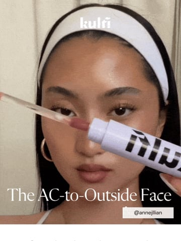
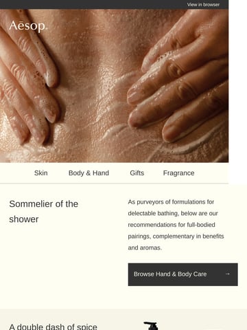
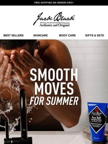
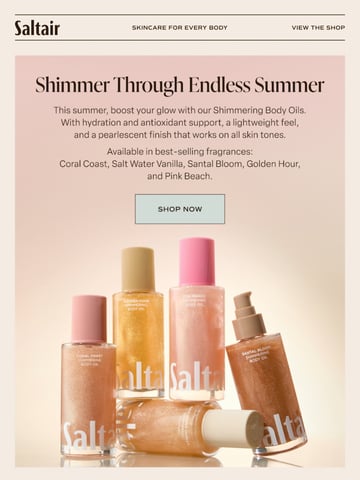
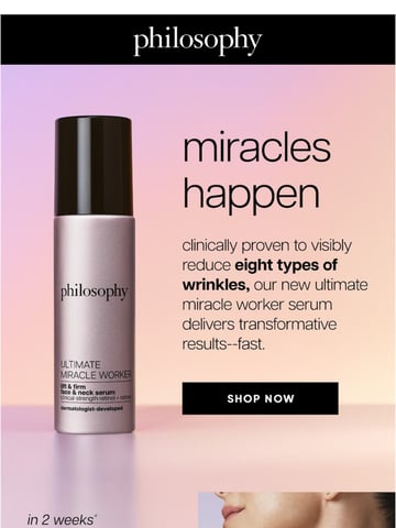
Beauty email sells transformation in a scrollable format: skincare routines, ingredient education, shade-finding, and the replenishment rhythm that makes the category one of email's strongest. This hub collects curated sends from brands like Aesop, KraveBeauty, Salt & Stone and Fur.
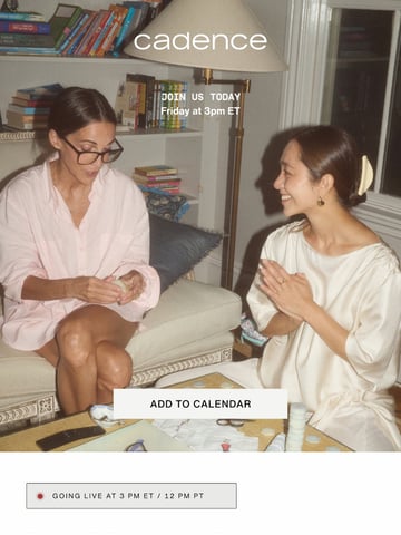
Two design registers dominate the grid: clinical calm (white space, ingredient callouts, texture macro shots) and editorial warmth (skin in real light, routine storytelling, before-and-afters handled with care). The best brands teach relentlessly: what the ingredient does, where it fits in a routine, why the texture matters. Education is the category's conversion engine because every purchase is a small act of trust.
The lifecycle does heavy lifting too: sampling-to-full-size journeys, replenishment timed to product life, and routine-expansion cross-sells. See the neighbors in fashion emails, healthcare & wellness emails and post-purchase emails.
Ranked by real reader views on Email Love over the last 90 days.
Pulled verbatim from sends in this collection. Every line links to the actual email it opened.
What the sends in this collection actually do, measured from our own archive.
Subject stats from 523 curated emails in this collection; GIF and word stats from the 424 analyzed sends.
Education plus proof: ingredient explainers, routine placement, texture and application imagery, and reviews doing the claims work. The categories that teach best convert best, because beauty purchases are trust decisions about one's own skin.
Timed to the product's real life: a moisturizer that lasts eight weeks earns a refill nudge at week six or seven, ideally with one-tap reorder. Replenishment flows are quiet revenue engines for consumable beauty, outperforming most campaign sends.
Clinical minimalism (white space, typography, macro textures) for skincare-science brands, and warm editorial (real skin, real light, routine narratives) for lifestyle-led ones. Both share restraint: the product and the skin are the visuals; decoration is kept out of the way.
Honestly and gently: consistent lighting, realistic timelines, and framing that celebrates progress rather than manufacturing insecurity. Regulators and subscribers both punish overclaiming; the strongest brands let reviews and routines imply the result.
Designing your beauty email?
Design it in Figma and export production-ready HTML straight to your ESP with the Email Love plugin. Build it in Figma →