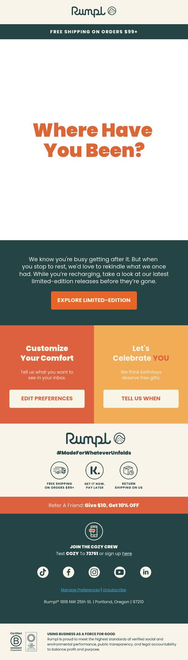
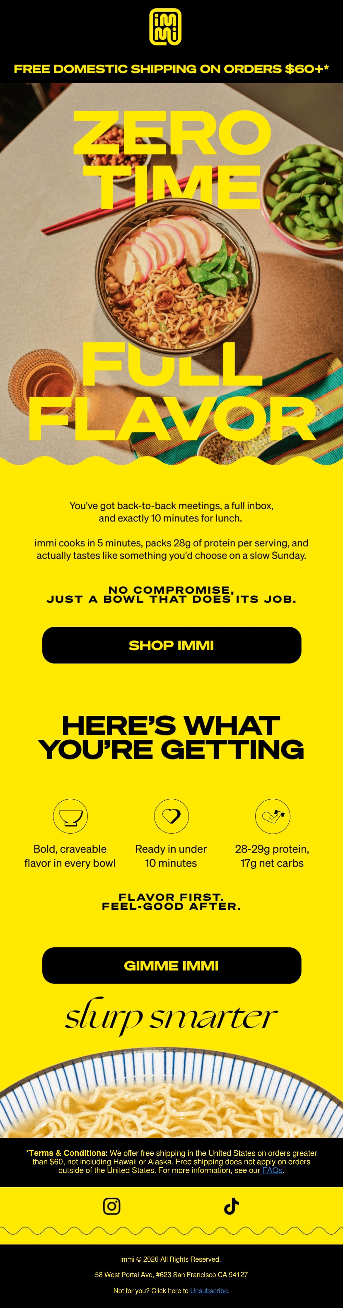
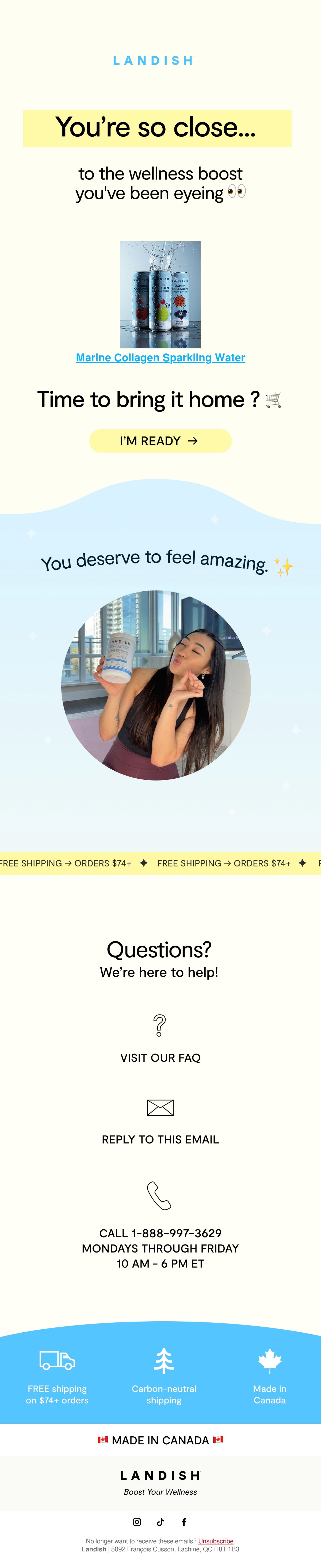
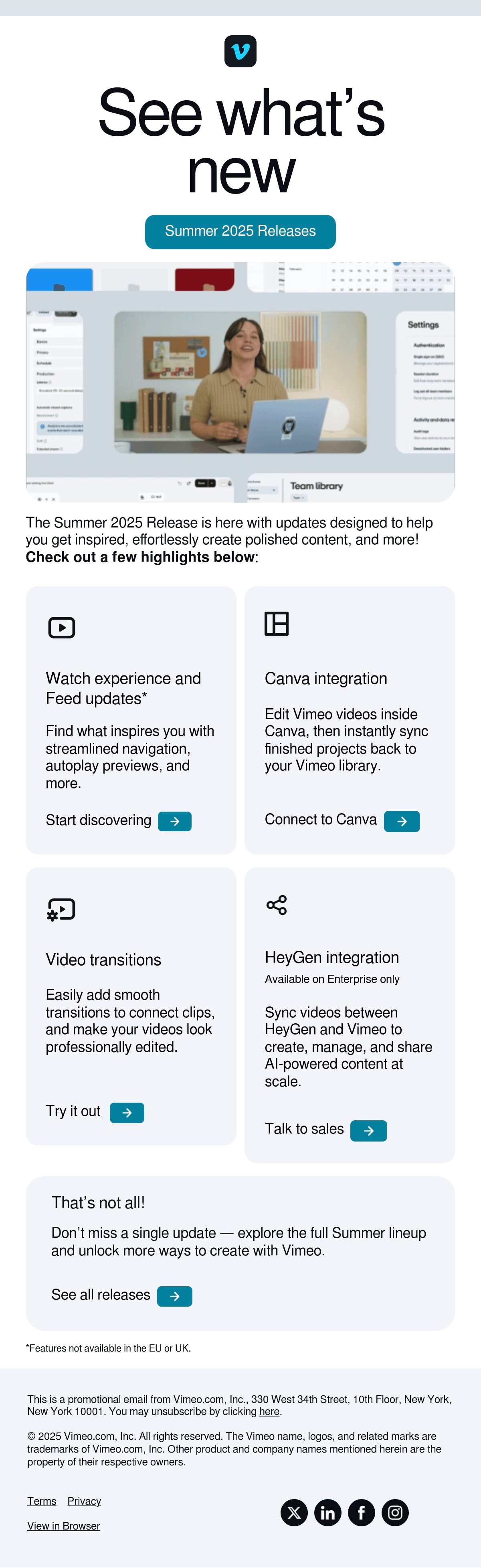
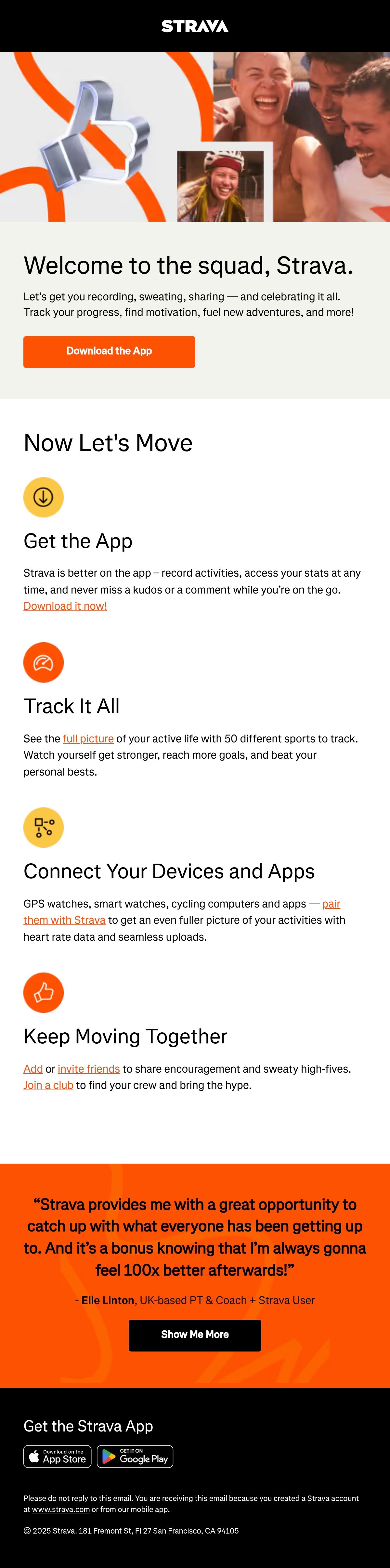
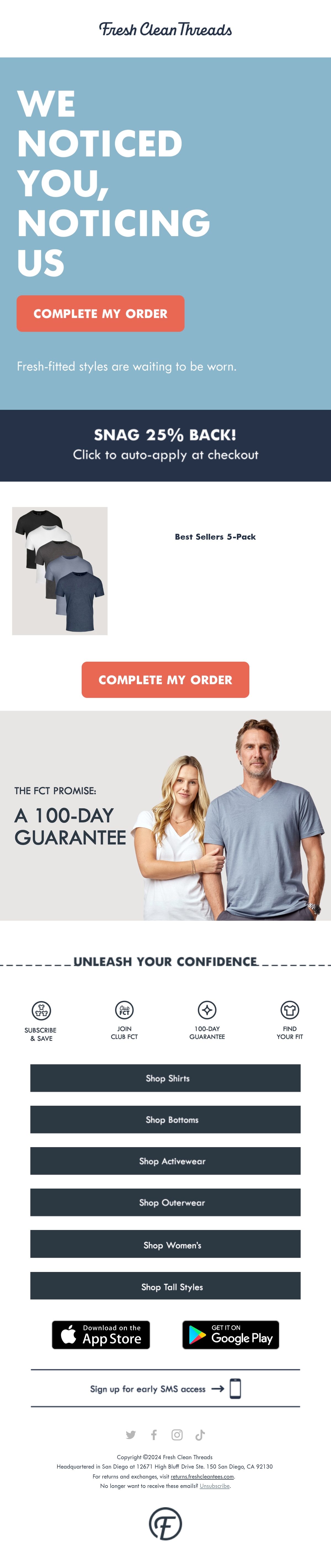
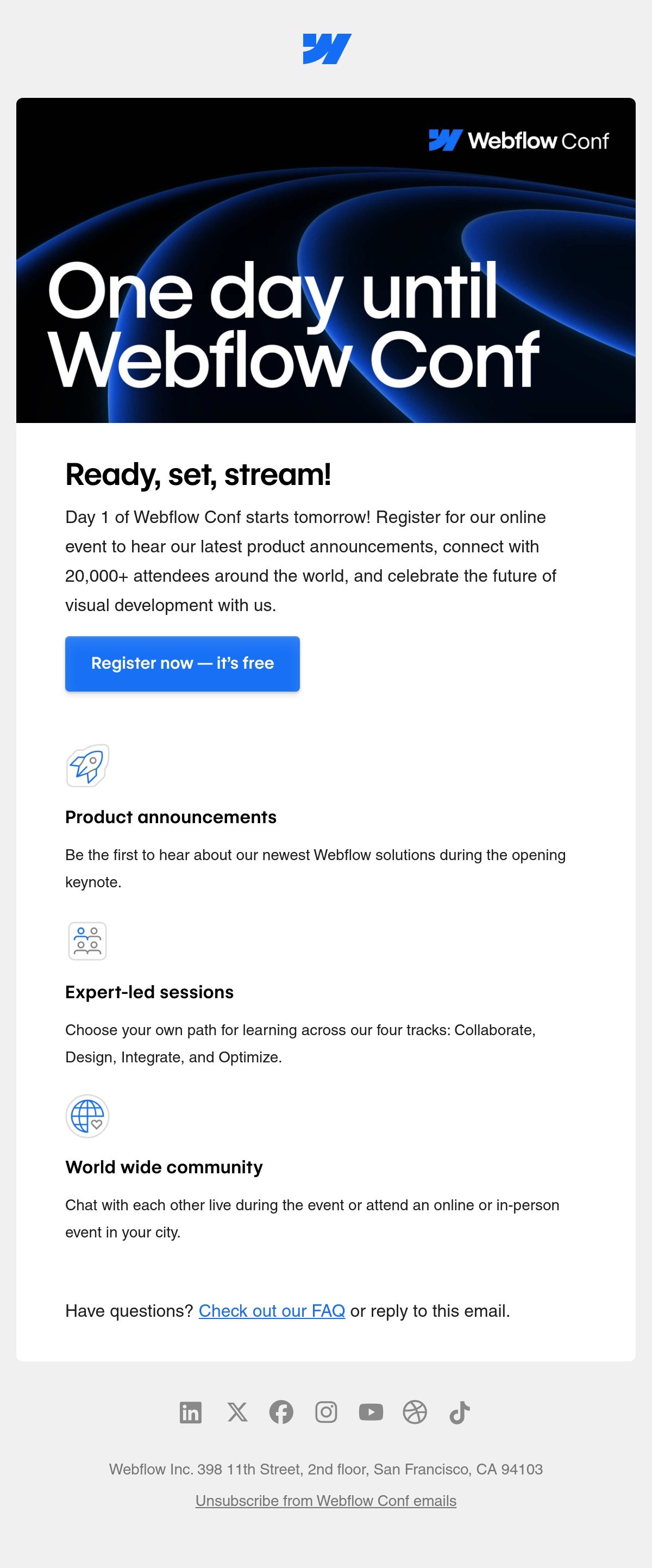
Icons compress meaning into a glance, letting brands label benefits, steps, or features without long copy. The strongest examples keep a consistent style (line weight, fill, corner radius) and pair each icon with a short label, since an icon alone rarely reads clearly. Watch for restraint: too many icons clutter the layout, and tiny glyphs lose legibility on mobile.

Ranked by real reader views on Email Love over the last 90 days.
Pulled verbatim from sends in this collection. Every line links to the actual email it opened.
What the sends in this collection actually do, measured from our own archive.
Subject stats from 301 curated emails in this collection; GIF and word stats from the 106 sends our insights engine has analyzed here.
Designing your next email?
Design it in Figma and export production-ready HTML straight to your ESP with the Email Love plugin. Build it in Figma →